Pics to come
I make some simple tools for making color charts. Grids and such for mixing color triangles and color/value grids.
They are free in the U.S. All you have to do is pay shipping. Other countries are to be determined.
I make some simple tools for making color charts. Grids and such for mixing color triangles and color/value grids.
They are free in the U.S. All you have to do is pay shipping. Other countries are to be determined.
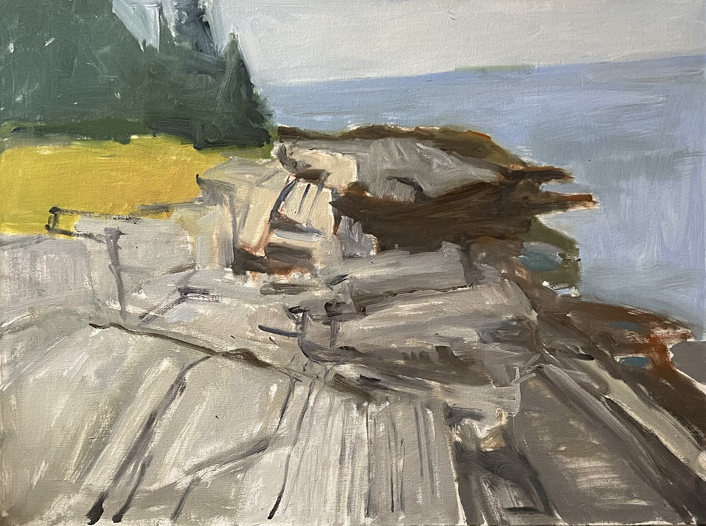
Making progress. Snowy weekend ahead so maybe more? 2/20/26
Untitled 18 x 24 oil on canvas tip
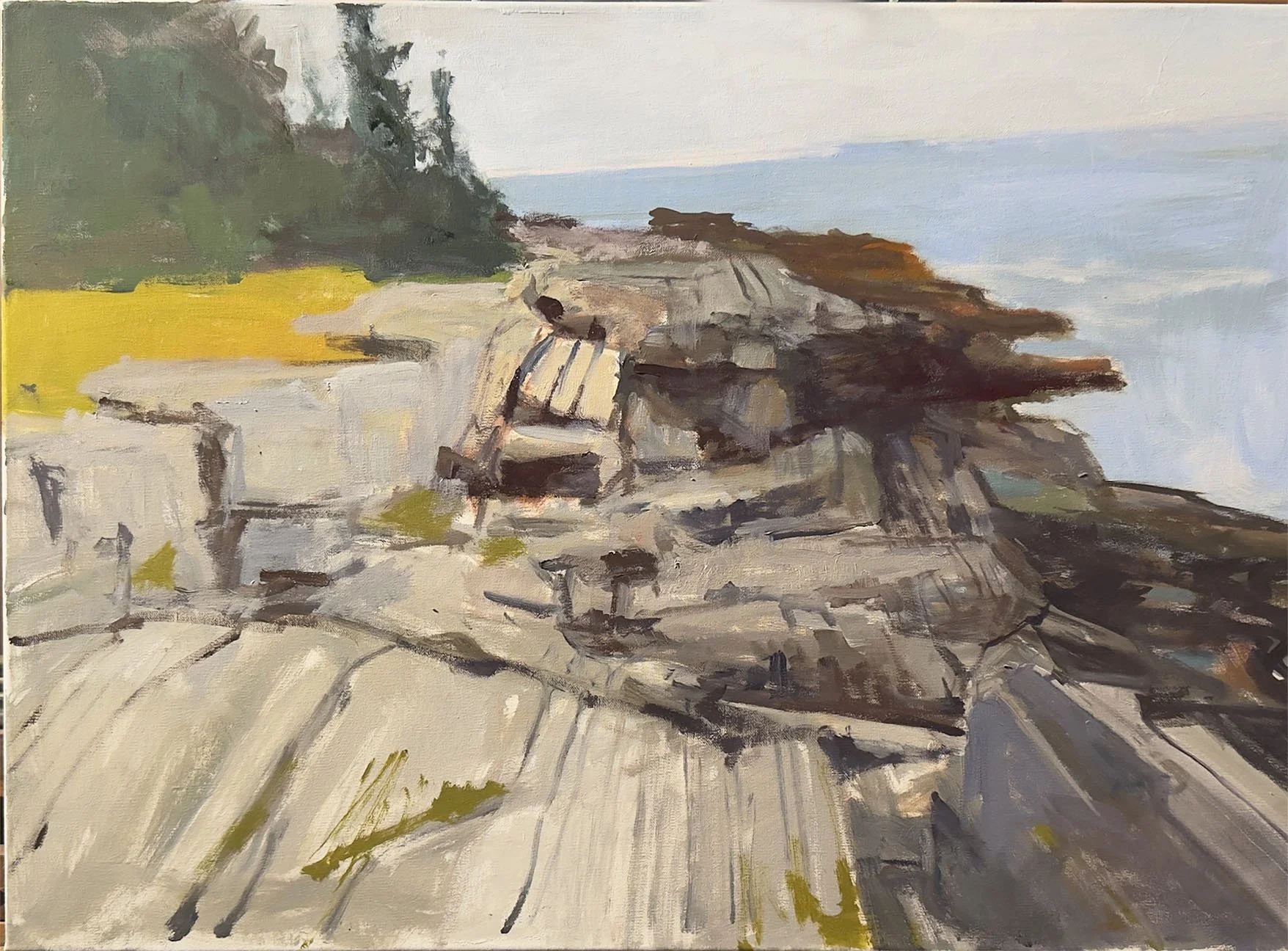
update.
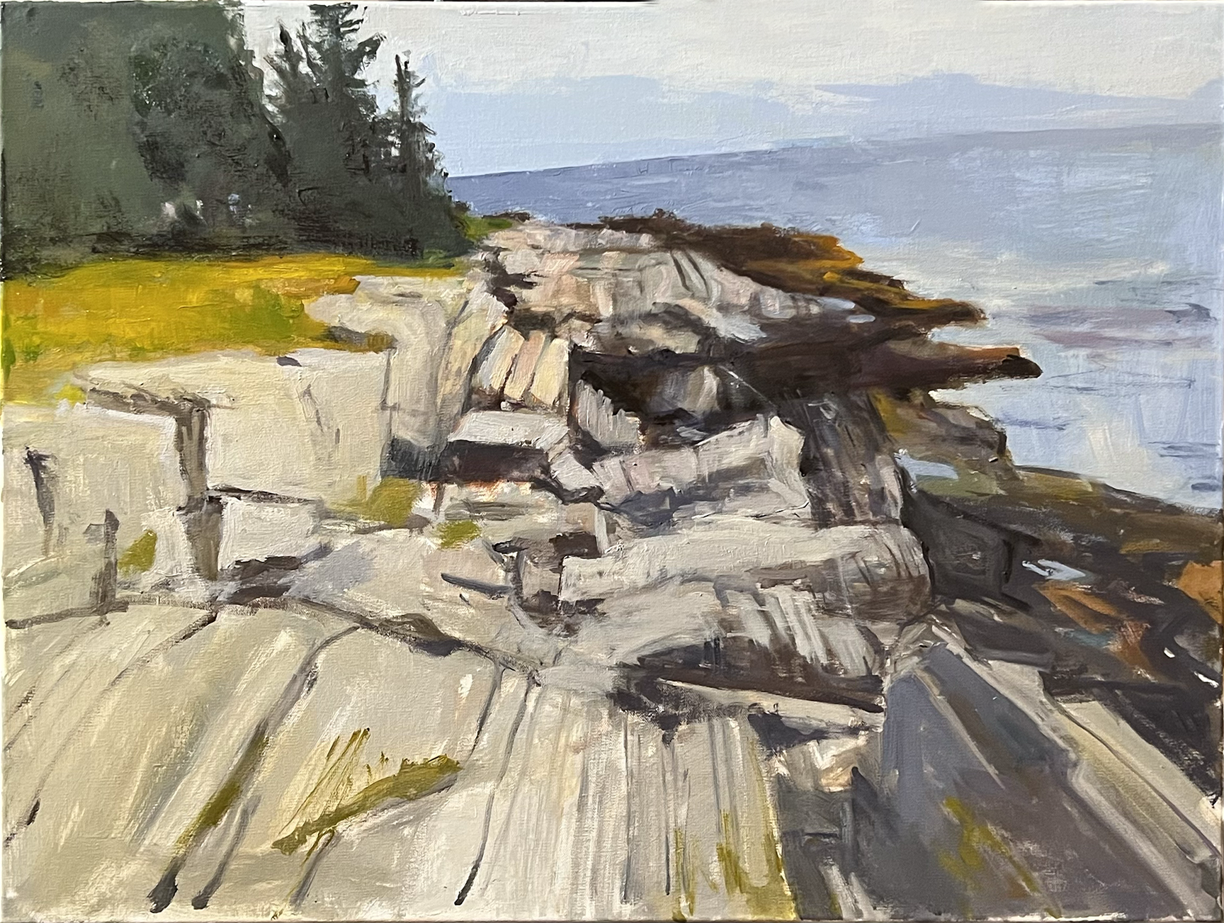
Update 3.6.26
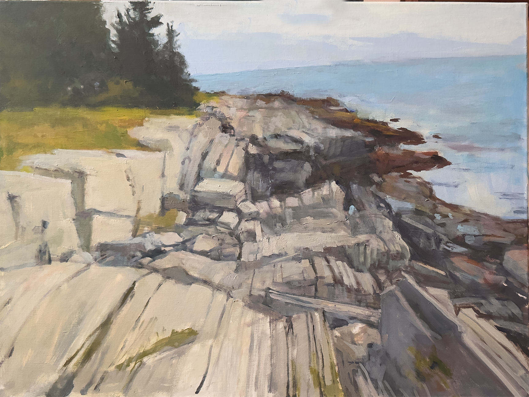
I started a new painting at Peters workshop last week. No drawing. Just roughly started painting in the forms. It’s now bone dry and I can start the correct to finish process. This summer we will be spending 2 weeks in Maine about a quarter of a mile from this spot right on the coast. Can’t wait.
I will keep posting progressions until the finish. Stay tuned.
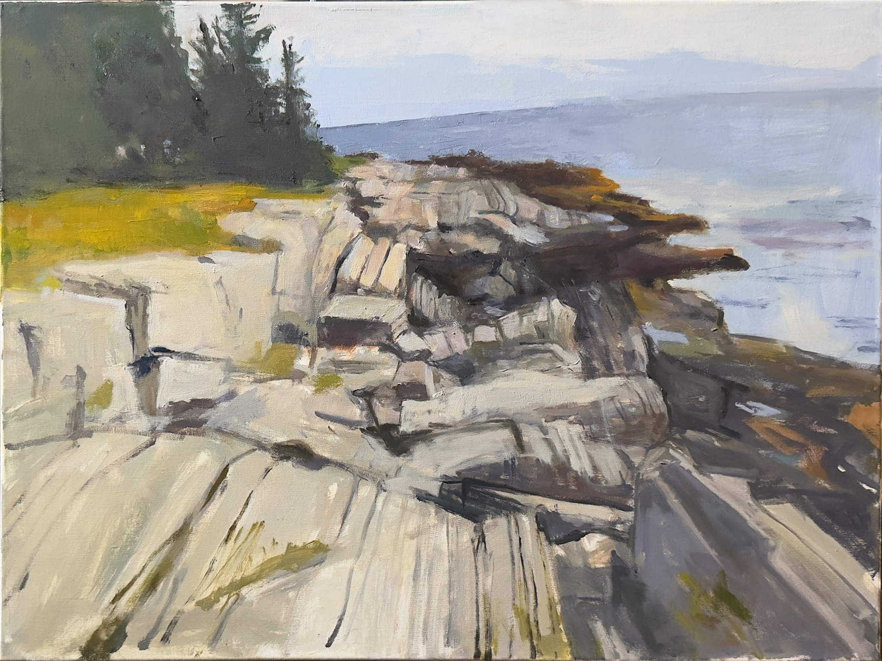
update 3.9.26
Draw paint and repeat… repeat and repeat
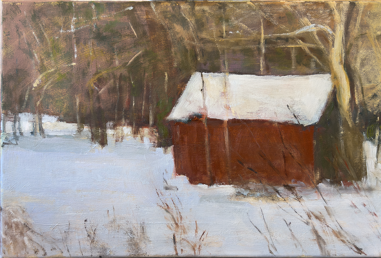
This is our red barn. It’s on it’s last legs. At over a hundred years old it has served it’s owners well.
There’s no title yet. It was painted last weekend at a 3 day ‘workshop’ with Peter Fiore and a small group of regulars. This was painted over a failed painting of this barn from 4 or 5 years ago. This attempt was more successful. A 4 hour or so effort. Happy with the soft feel. Details to come later.
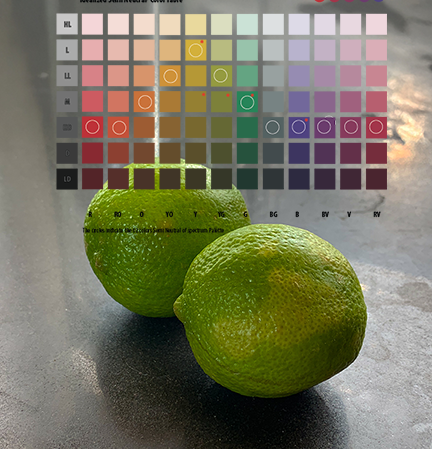
This is a new old thing here. I made a mefium dark rosey background as a challenge.
I drew the limes with a pastel pencil.
I chose a palette that doesn't have a strong yellow or green… am I nuts.
It’s the start
6x6 oil on panel ‘25
I used only the Red, Yellow and Blue colors of the Semi Neutral Table to mix my color. In the end I’m hoping the the values tell to story.
I’ll wait til it’s bone dry then Ill glaze some full intensity color to see how that works.
I just started to lsy down some part on a 12 x 9 panel of my dog Spot. He 4 now. I am getting old. This is about 25 minute of drawing with a brush.
About 4 and a half hours of painting later… This has to set a bit to dry. Needs some major and minor corex. Maybe anonother couple of hours +??
While I’ve been painting I’ve been printing these guy on my Bambu Printer. The rack is 6 piece that print flat. They can be broken down for travel. size is 6.5” x 7.5” x 3.25”.
I haven’t been selling them and don’t think I will. I’ve been giving them away a workshops and to friends.
Drop a comment if you want one for free. Post would about 4 or 5 buck. US only.
I have 3 of these up at all times. One at the easel. One at brush washing station. One for drying wet brushes.
I designed this in CAD a few tears ago. I had the CAD file on an online service under the Creative Commons license. Somebody swiped the file and was selling them on a craft service. I contacted the service and they took it down. That was discouraging.
Now I only give them away. I might make a dozen or less a month.
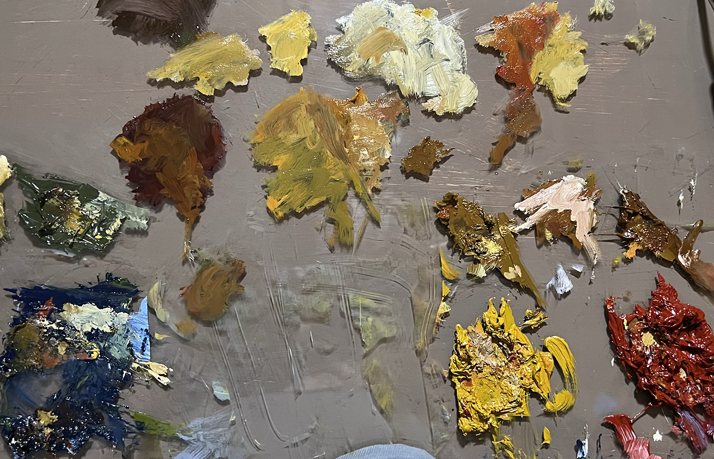
I set a challenge for myself to make a painting using only the semi neutral and neutral color from the Dudeen Palette. Think of them as metaphors for the full intensity primaries. I would this onion that U had photographed from last fall. I set up a small are on my palette (see below) and mixed up some colors I had semi neutral blue, yellow and red.
Wipe those tears from your eyes. 6x6 oil on panel ‘25
Sort of a messy looking palette in the end. For the onion I used only the Blue, Yellow and red neutrals with white and a ver small tint of Cad Yellow. The bag rounds are mixed from Neutral Blue and Red with some Ulyramrine Violet and Alizarin Crimson.
I took about 4 hours over 3 days. It only needs a few days to setup and a tiny bit of Glazing.
I have had health issue that have slowed my painting down a lot over the past couple of years. Recently I attended one of Peter Fiore’s painting workshops to see if I could fix a couple of major hitches I had developed. I found them and fixed ‘em.
Here is one of the paintings I’m working on now. I will be pushing this to finish over the next few days.
Finish
A lobsterman’ tender filled with ice in the snow at Pine Point, Maine
Oil on canvas 13.25 x 18 inches
The colors were all based on a set of idealized Primaries.
All of these colors were made from the 3 primaries. There were synthesized in adobe Illustrator to match an Idealized set of R,B and Y primaries. The Illustrator color space is set to CMYK. CMYK is the same as the subtractive color mixing process as mixing color pigments. It’sot perfect at all but pretty damn close. I use this technique for oils and watermedia.
For contrast I asked ChatGPT how many colors of oil paint does Old Holland sell, ChatGPT answered “Old Holland makes 168 colors in their Classic Oil Colours line”.
There are 252 ‘colors’ represented here. Not really a fair comparison be you get the picture.
The mothod of mixing is as follows;
I find the color in the 2 neutral palettes by mixing the tertiaries. To find the metaphoric primaries of Semi Neutral you ix the 2 adjacent tertiary to the primaryies. Yellow Orange and Yellow Green make the Metaphoric Yellow of there semi Neutral. Red Orange and Red Violet make the Metaphoric Red. Blue Violet and Blue Green make the Metaphoric Semi Blue primary..
The Full Intensity 12 color spectrum palette
The Semi Neutral 12 color Spectrum Palette. Note how these colors are not darker, just more subdued.
The Hue or Neutral 12 color Spectrum Palette Note how thees colors are even more subdued.
The Primary Complimentary Pairs. Pretty powerful colors in themselves.
The Primary secondary complimentary pairs add amazing color possibilities
If you’ve noticed thee colors get very interesting when the Tertiaries are involved
Metaphoric Primaries? Are You Nuts?
Next Time
Where to start?
I use a basic set of paints which have evolved since I learned to them up from a Walter Foster book on painting clowns when I was 14. Art school taught me about Albers and color theory. We worked with acrylics, watercolors, or gouache. My palettes still had primary and secondary colors, but they weren’t very organized. Eventually, I started using colors in a more organized way.sometime in the 1980s. Usually in limited watercolor or acrylic palettes. Each painting demanding its own mix.
About 14 years ago I stated with oils as my primary medium and quickly created a more standard though shorthand set up. I did a few good painting that still hold up today. I started painting from models with a small group of artists. All way better that me. After I while I picked up some tricks from them. The one in particular that fits my brain is the 12 color spectrum palette. And in particular the making that set from just the three primaries of red, blue and yellow. Miraculous! I learn this from Judith Reeve.
I have documented this process in s sort of schematic manner, After all I was a data visualization art for a long time.
Here are a few frames from it. The color is idaelized. This document was made in Adobe Illustrator using a CMYK profile. Subtractive color the same as mixing oil paints.
This triangle represents the 12 color spectrum mixed from the primaries. Making The secondary, and tertiary groupings. More on this later.
This shows the outer color in therir full intensity. Along with 2 inner triangle the are mixed a metaphoric way to neutralize the ‘parent’ triangles. A lot more later.
This is the basic mixing of the parent 12 color spectrum.
There’ll be a lot more on this when I get the time. I will be glad to answer any questions - jkingston@mac.com. It is fishing season so it may take a bit if time
A lot of charting goin’ on. Note the wave going on here.
Back in late September I had a heart attack. I wouldn’t recommend it. Since then I’ve been working hard at Cardio Rehab. Almost done. I haven’t been able to paint much. I tried doing Peter’s workshop back in January. I had to cut it short.
I’m loosing some weight and had gotten my sugar under control. I’ve lost connection with people and my woek. The joys of getting old I guess.
I am starting on a piece started back last June-ish. Our model Cathering showed up for about a month. I can’t tell you how much fun it was to paint in Johan’s studio again. The wonderful natural light! We started 2 paintings then she disappeared to Burning Man.
I took the small painted sketch, scanned it up and printed it on canvas. I’ve done this in the past and it works great..
The print is stapled to a heavy foam core. I started a little bit last week. The photo of the pose is on the right. I shocked myself with how well I grabbed the pose in just an hour and a half.
We hadn’t painted together since March of 2020. I hadn’t painted since early summer of 2024. And before that spring of 2023 after conking myself into a concussion.
I’ll keep you pasted
When I was younger I did what today seems like a million different things at once. Working during the day in an Ad Agency, doing freelance editorial illustration at night until the wee hours. And somewhere in-between teaching myself to program computers in a couple of different languages.
Today I don’t have to actually do anything. For 2 reasons. 1. I’m an old fart living off my pension's. 2. AI is displacing much of what I used to do.
I play with 2 AIs mostly. Chat GTP and Midjourney. In Chat GPT I can write just about anything from elaborate posts to programing functions in a variety of computer languages. In Midjourney I can create images from straight up realism to amazing imaginations in countless graphic styles.
Let’s imagine i’m in my late 30’s and sober. I have a client that is opening a couple of small bars catering to an upscale younger crowd…
Fist I ask GPT for a name… We select this name Pour & Pair. Then I ask MJ for a logo…. we pick this one.
… and a photo… made in 3 minutes in Midjourney
A headline will be nice. I ask Chat GPT… we choose
Flavors and Friends. The New Age of Wine and Dine
…and some ad copy.
At Pour and Pair, we blend the allure of fine wines with gourmet bites in a setting that's both chic and welcoming. Perfect for after-work relaxation or weekend gatherings, we offer a curated selection of wines paired with artisanal, locally-sourced dishes. Our lively atmosphere, designed for the young and young at heart, invites you to unwind, socialize, and indulge in a sensory journey. Join us and make your moments memorable
In about 20 minutes my fat arthitic fingers, feeble mind and failing eyes created a framework for said ad.
I had a variety of clients back in the late 70s doing just this sort of thing. But I had to draw up layouts or several layouts. Take some photos, or have them taken. Maybe draw a humorous illustration. Then on approval make final mechanical. Send the mechanical and images to a engraver where the mechanical and images were made into films for reproduction for every magazine the ad was to run in.
If we’re not completely looking for immediate result and do more detailing over a little more time today’s way may be better than the old way. Way Cheaper.