An apple painted for the sixes fundraiser show at the ;cal arts association.
No title - Oil on panel 6 x 6 2023
An apple painted for the sixes fundraiser show at the ;cal arts association.
No title - Oil on panel 6 x 6 2023
I started an account on chatgpt recently. I ask for a basic forula to mix a 12 color spectrum pallete from the primaries. I was fully expencting some nonsense. Here's what I got from the first pass in 10 seconds.
Creating a 12-color artist palette using only red, yellow, and blue oil paints allows you to explore the fundamentals of color mixing. These primary colors, when combined in various ways, can produce a wide range of hues. Here's an outline for a script that will guide you in doing so:
Mixing a 12-Color Artist Palette from Primary Oil Paints
Introduction:
Brief about the significance of the three primary colors: red, yellow, and blue.
The idea behind creating a diverse palette using only these colors.
Materials needed: Red, yellow, and blue oil paints, palette knife, mixing surface (glass or wooden palette), and paper towels or rags.
Steps to Mix the Palette:
Setting Up the Primary Colors:
Place a dab of each primary color - red, yellow, and blue - on the palette, spaced out.
Creating Secondary Colors:
Orange:
Mix equal parts of red and yellow.
Green:
Mix equal parts of yellow and blue.
Purple:
Mix equal parts of red and blue.
Creating Tertiary Colors:
Red-Orange:
Mix 2 parts red with 1 part yellow.
Yellow-Orange:
Mix 2 parts yellow with 1 part red.
Yellow-Green:
Mix 2 parts yellow with 1 part blue.
Blue-Green:
Mix 2 parts blue with 1 part yellow.
Blue-Purple:
Mix 2 parts blue with 1 part red.
Red-Purple:
Mix 2 parts red with 1 part blue.
Enhancing Palette Diversity:
Darkening Colors: Mix a bit of blue into a color to create a shadow shade.
Lightening Colors: If you have white paint, you can mix it with any color to create a tint.
Important Tips:
Always clean the palette knife thoroughly before dipping into a new color to avoid unintentional mixing.
Start with smaller amounts of paint and add more as needed to get the desired shade.
The ratios mentioned can be adjusted based on the specific shades of primary colors you have. Experiment to find the perfect mix.
Oil paints can take a long time to dry, so ensure your mixed colors are kept in airtight containers if you wish to use them later.
Conclusion:
The versatility of primary colors in creating a wide palette.
The benefits of understanding color mixing for an artist.
Encouragement to experiment and explore beyond the 12-color palette for even more hues.
This script is a basic guide, and individual results may vary depending on the specific brand and hue of your primary colors. Remember, mixing colors is as much an art as it is a science, so trust your instincts and enjoy the process!
Next morning—
I'm looking for a neutralized 12 color palette based on the 12 color spectrum palette. As described by John Sloan's "on Drawing and Painting"ChatGPT
John Sloan, a prominent American artist and a member of the Ashcan School, was known for his insights into color theory. In "John Sloan on Drawing and Painting," he describes a spectrum palette. A neutralized version of this palette would mean taking each of these vibrant colors and toning them down, making them less chromatic and more muted.
To create a neutralized version of the 12-color spectrum palette, you'd typically add a color's complement (its opposite on the color wheel) or a grey to subdue its intensity. Here's how you can approach a neutralized 12-color spectrum palette based on Sloan's descriptions:
Neutralized Red:
Add a touch of green to subdue the vibrancy of the red.
Neutralized Red-Orange:
Tone down with a hint of blue-green.
Neutralized Orange:
A touch of blue will neutralize the brightness of orange.
Neutralized Yellow-Orange:
Add a hint of blue-purple to subdue this color.
Neutralized Yellow:
Neutralize with a touch of purple.
Neutralized Yellow-Green:
A hint of red-purple will tone down the vibrancy.
Neutralized Green:
Red will neutralize green.
Neutralized Blue-Green:
Red-orange will neutralize blue-green.
Neutralized Blue:
A touch of orange will neutralize blue.
Neutralized Blue-Purple:
Yellow-orange will tone down the vibrancy of blue-purple.
Neutralized Purple:
Neutralize with yellow.
Neutralized Red-Purple:
Add a hint of yellow-green to tone down red-purple.
When neutralizing colors, the key is to add the complementary color slowly and sparingly. It's easy to add more if needed, but you can't take it away once it's mixed in. The goal is not to turn the colors into mud but to simply reduce their chromatic intensity, giving them a more subdued and harmonious appearance.
Using a neutralized palette can result in a more harmonious and cohesive piece of artwork, especially in scenes where bright, vibrant colors may not be appropriate or desired.
I'm really looking for the techniqueof starting by making a metaphor of the primaries. Mixing terries. For example Red orange mixed with red purple as a metaphor for red, Blue green mixed with blue purple as a metaphor for blue and yellow orange mixed with yellow green as a metaphor for Yellow. ChatGPT
Ah, I see! You're talking about a more complex and nuanced approach to the palette where the primary colors aren't the typical bold primaries (Red, Yellow, Blue) but rather a composite or "metaphor" of two adjacent tertiary colors. This technique can yield a very sophisticated, muted, and harmonious palette, as the colors you're starting with are already somewhat neutralized.
Let's build a palette based on this concept:
Metaphoric Primaries:
Red (Metaphoric): Red-Orange + Red-Purple.
Blue (Metaphoric): Blue-Green + Blue-Purple.
Yellow (Metaphoric): Yellow-Orange + Yellow-Green.
From these metaphoric primaries, we can derive the secondaries and tertiaries:
Secondary Colors:
Orange (Metaphoric): Mix metaphoric Red and metaphoric Yellow.
Green (Metaphoric): Mix metaphoric Yellow and metaphoric Blue.
Purple (Metaphoric): Mix metaphoric Blue and metaphoric Red.
Tertiary Colors:
Red-Orange (Metaphoric): Lean your metaphoric Orange mix closer to the metaphoric Red.
Yellow-Orange (Metaphoric): Lean your metaphoric Orange mix closer to the metaphoric Yellow.
Yellow-Green (Metaphoric): Lean your metaphoric Green mix closer to the metaphoric Yellow.
Blue-Green (Metaphoric): Lean your metaphoric Green mix closer to the metaphoric Blue.
Blue-Purple (Metaphoric): Lean your metaphoric Purple mix closer to the metaphoric Blue.
Red-Purple (Metaphoric): Lean your metaphoric Purple mix closer to the metaphoric Red.
In essence, these colors are twice removed from the original, clear primaries. Because of the intricate mixing, the resulting colors are muted and complex, giving depth and sophistication to your palette.
The benefit of this approach is the inherent harmony within the palette. Since all the colors share components with their neighboring hues, it's challenging to create discordant color combinations, making it an excellent palette for unified, cohesive compositions.
Remember, the ratios in which you mix will determine the exact hue of each color, so you might need to experiment a bit to get the desired shade.
And the next evening
Can we expand the metaphor further?
ChatGPT
Certainly! The concept of using metaphoric colors can be expanded to delve even deeper into the intricacies of color mixing. Let's break it down further using a "second-level" metaphor approach, going beyond the primary metaphors.
Second-Level Metaphoric Primaries:
Red (2nd Level Metaphoric):
Combine a tertiary mix from the first metaphor (e.g., a mixture leaning towards Red-Orange) with a tertiary mix leaning towards Red-Purple.
Blue (2nd Level Metaphoric):
Combine a tertiary mix leaning towards Blue-Green with one leaning towards Blue-Purple.
Yellow (2nd Level Metaphoric):
Combine a tertiary mix leaning towards Yellow-Orange with one leaning towards Yellow-Green.
From these second-level metaphoric primaries, you can derive another set of secondary and tertiary colors:
Second-Level Metaphoric Secondary Colors:
Orange (2nd Level Metaphoric):
Mix 2nd level metaphoric Red with 2nd level metaphoric Yellow.
Green (2nd Level Metaphoric):
Mix 2nd level metaphoric Yellow with 2nd level metaphoric Blue.
Purple (2nd Level Metaphoric):
Mix 2nd level metaphoric Blue with 2nd level metaphoric Red.
Second-Level Metaphoric Tertiary Colors:
Red-Orange (2nd Level Metaphoric):
Lean your 2nd level metaphoric Orange mix closer to the 2nd level metaphoric Red.
Yellow-Orange (2nd Level Metaphoric):
Lean your 2nd level metaphoric Orange mix closer to the 2nd level metaphoric Yellow.
Yellow-Green (2nd Level Metaphoric):
Lean your 2nd level metaphoric Green mix closer to the 2nd level metaphoric Yellow.
Blue-Green (2nd Level Metaphoric):
Lean your 2nd level metaphoric Green mix closer to the 2nd level metaphoric Blue.
Blue-Purple (2nd Level Metaphoric):
Lean your 2nd level metaphoric Purple mix closer to the 2nd level metaphoric Blue.
Red-Purple (2nd Level Metaphoric):
Lean your 2nd level metaphoric Purple mix closer to the 2nd level metaphoric Red.
At this stage, the palette has been expanded into even more subtle and nuanced shades, each one being a complex mixture derived from multiple stages of color mixing. These colors will be inherently harmonious due to the shared elements in their mixtures.
However, as with any approach to color mixing, the key will be experimentation. Exact hues will depend on the specific pigments and ratios used, so it's always a good idea to test and adjust the mixtures as needed to achieve the desired outcome.
Fallen Greenies oil on panel 12 x 18 ‘23
In the fall of 2019 I gathered a bunch of Greeny apples from one of the apple tree in the town forest adjacent to our property. I build several variations of still life photos. The world went crazy and shut down. I lost track of the reference. Last month I found the reference for this and thought I attempt a painting. This is that attempt.
These are old ‘wild’ apple trees coming to their end. Over a season they collect all sorts of blemishes in the skin. Falling to the ground adds to the rough look.
They did taste good though.
CGI rendering of Brush Rack
Brush Holder in six pieces.
I’ve been prototyping for the last few days. It’s a ‘desktop’ version of one that I made a few years ago when I first got a 3D printer. ** A simple 2 pieces ‘rack’ that hangs from one on the trays on my rolling taboret‡.
I wanted a traveling version that will pack flat. This is 6 pieces that print flat in for best quality and strength. The flat pack design also makes it possible to laser cut this in 1/8” or 1/4” wood stock.
This version shown holds 9 brushes on the top. There will also be variations that hod up to 12. It works well with some portable plain air add ons I’ve made.
It a simple solution it does take a day to print.
https://www.printables.com/model/562232-brush-r
A Little Piece of Sun 15 x 30 oil on linen 2023
This painting was done at Peter Fiore’s workshop in January ‘23. It’s a temperature study at high intensity color. A piece of sunlight peeking through the clouds on a winter cornfield. Maybe this will get done bigger. This was more than a painting it was post Covid therapy.
Route 652 6 x 6 oil on panel ‘22
For about 7 years i’ve collected apples from ‘orphan’ apple trees around the area.. Trees that have lone been abandoned or have popped up from the inadvertent apple core tossed from a moving car. These past 2 years have been slim pickings. Hot summer in 2021 and drought in 2022 offered up just a few productive trees. It was a big competition with the ever growing herds o deer. I collected only 4 fruit this year. This is one. A different set up for me. A happy accident maybe. Random geometry and a sort of beat-up apple. Enjoy.
It’s that time of year again. The DVAA Sixes show looms.
Opposing cucumbers on an old Pepsi case. Pretty simple but needed some little brushes to make it work. Now for some nice tomato slices and Balsamic Vinegar.
Cuke ‘O Rama 6 x 6 Oil on panel ‘22
This is a painting I started in March. This was done over the past 2 months a little bit at time after dropping two earlier attempts. This is the eddy pool above Skinner’s Falls on the Upper Delaware River painted in a relatively limited palette. Late in the day the sun reflects off the trees on the New York side of the river. A phenomenon that happens all year ‘round.
This is nearly finished. I have to wait a while for the colors to sink. Then I’ll ‘oil the painting out’ to see if anything needs adjusting.
Eddy in Fall 16 x 24 0il on linen panel ‘22
A color corrected robot MidJourney
When we got back from a couple of weeks off I got on the computer and found an AI application called MidJourney. You simply feed it a phrase like ‘A male robot color corrected’. Not my phrase be a found image on MJ.
This is amazing in several ways. The insanity of the idea and the construction. The quality of the render and the color choices. This could be a artist’s reference for a painting or building a prop or even creating a character for a story.
I did not think I’d see the level of AI driven imagery in my lifetime. Let alone on my laptop. The images are created in just a few minutes!
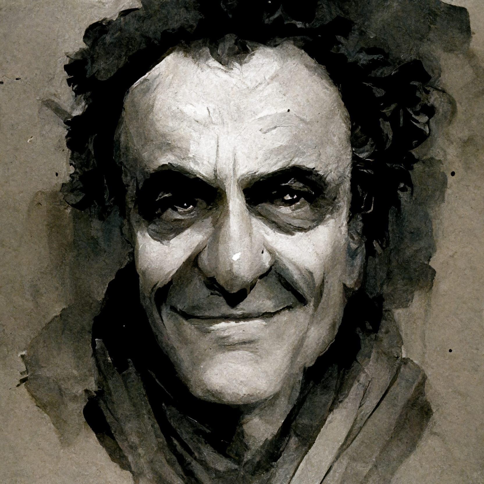
Here is an image I asked for. A characture of an old man. Here is the result . The color choice is harmonious. The character is a story. A novel. The lighting from above is realized correctly. The color choices!
More discoveries…
Joe Rogan as a steampunk gorilla
A man in the style of James Gurney
This ceramic bird is from my grandmother’s kitchen. It used to sit on the kerosene stove holding wooden wooden matches in it’s mouth hoping for a treat. I was always drawn to it as a kid. My Great grandmother and Grandmother lived in a little house by the railroad tracks. No hot water. No heated basement. When they washed the dishes they had to heat water in a kettle.
I placed it in this Robin’s nest amount some dried reeds. Sort of an exercise in focus. Mostly neutral color as I like it. Watercolor and gouache with some airbrush pushing the background back. I have a collection of bird nests for just an occasion like this.
Untitled ‘22
Watercolor and gouache on illustration board 10.5 x 12
Winter 12 x 18 Oc ‘22
It was a cold winter afternoon and I saw this rock outcrop near my house. There were many effects of light and shadow. There's open light, reflected and transmitted light. Warm, warmer and cool light. Wrapped in a white package. It only lasted a moment.
Painted loosely wet in wet using DMP medium and Lukas 1864 colors. I use a combination of good bristles and out of control bristles. Finishing with some small synthetic sables. The underpainting was laided down in March. Finished it this week. About 6-8 hours total.
This is the 'neutral palette'. Red violet, Blue Violet, Cobalt Blue, Ultramarine and Yellow Orange full intensity colors.
Semi neutral Blue (BG+BV), sn Yellow (YG+YO) and sn Red (RV + RO).
30 x 40 inches oc ‘20
This piece was from just before covid hit. I got hurriedly put away. I pulled it out recently and though that it was finished and why was hidden away. ? I signed it and here it is. A color interpretation of a cornfield coming out of winters sleep. A small community exists at the end oof the field built around the feed mill that plants and harvests the field.
My brushes ceramic ‘22
It’s time for a little whimsy.