We'll be have a talk and discussion period on Tuesday August 21st from 5:30 to 6:30.
Talking about the interplay and collaboration between artist and model.
Talking about the interplay and collaboration between artist and model.
My paintings of food have been mostly little. 9 x 12, 6 x 8 or 6 x 6. Fun little expressions. Excuses to fool around with paint. While looking at a 30 x 40 canvas I had hanging around I got the idea to painting a big piece of fruit on this canvas. I've painted pairs of pears many time over the years so I went back to that comfortable story.
Pairs oil on canvas 30 x 40 2018
My submission: 2018 oil on paper for DVAA auction based on 2016 sketch
Every summer The Delaware Valley Arts Alliance holds the Riverfest art and ecology street fair in the village of Narrowsburg on the Delaware River. One of the highlights is the auction of the artist's posters.
About 50 artists can make an original artwork on the preprinted blank posters to be auctioned for DVAA support. Link to last years entries.
It seems we have set the final pieces for the August show.
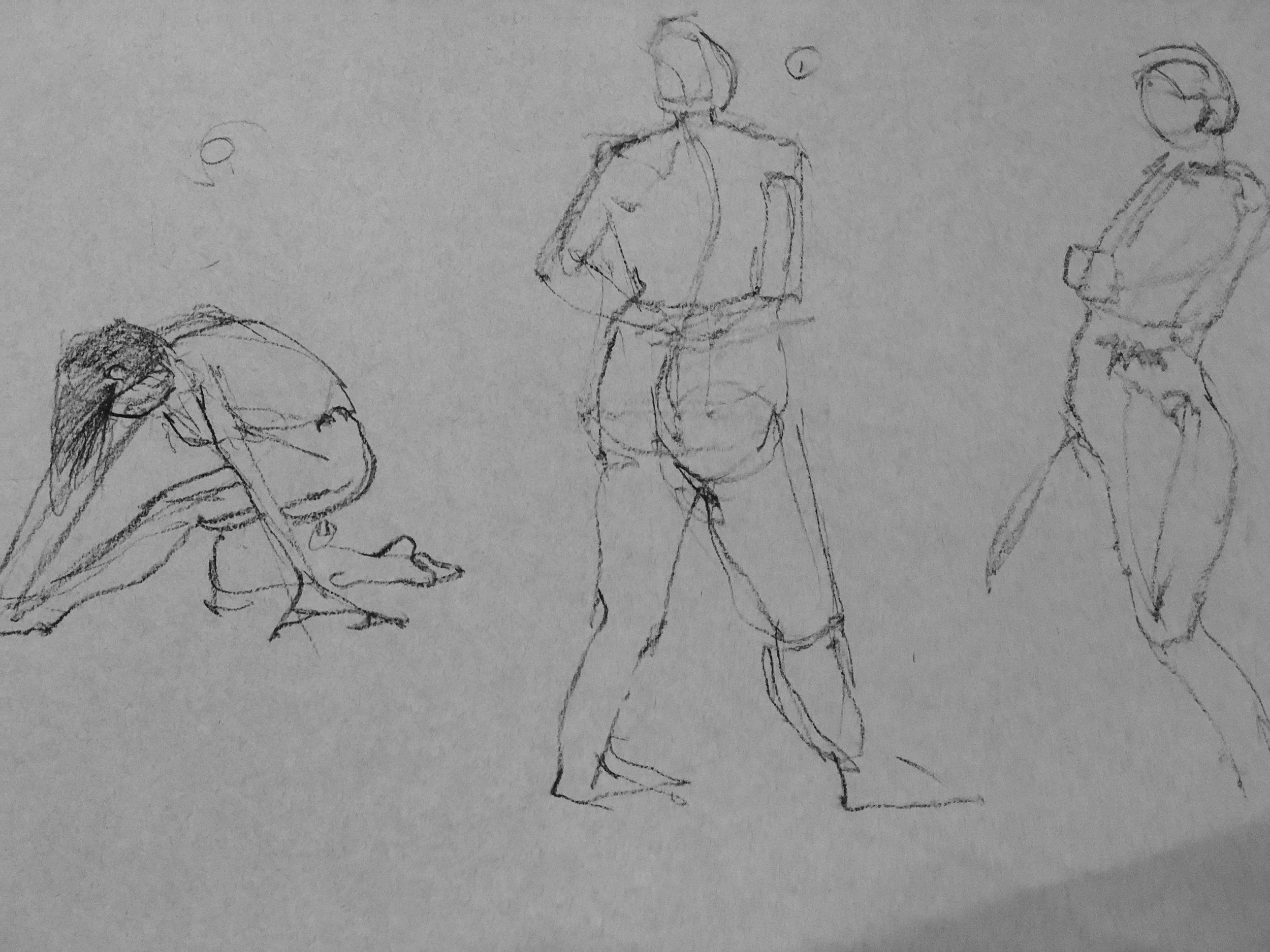
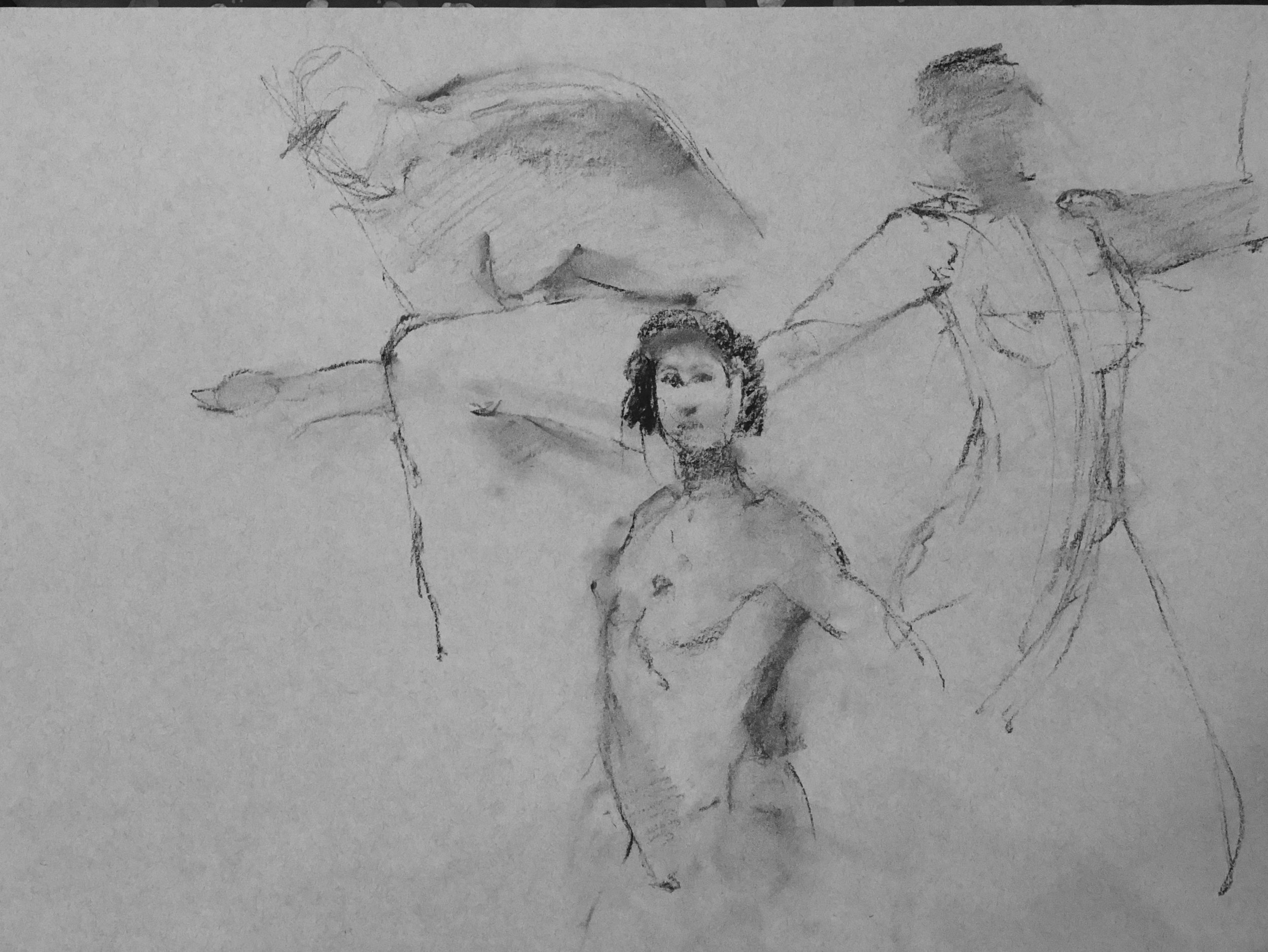
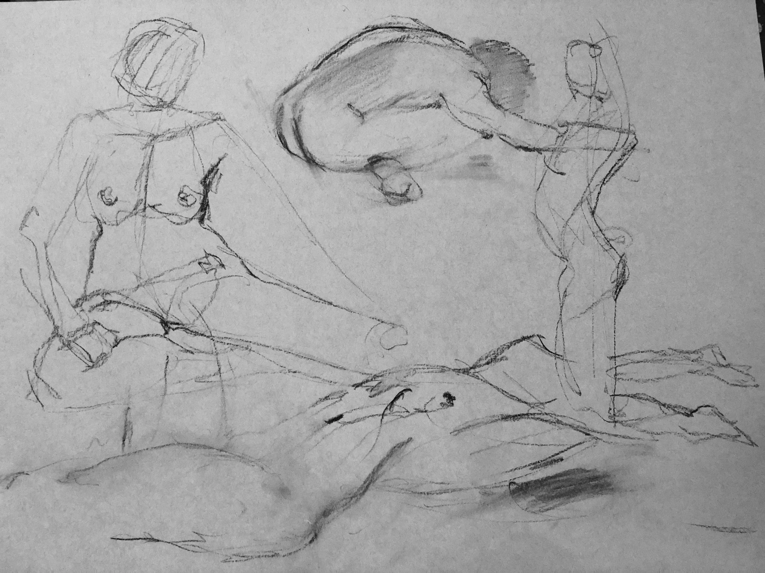
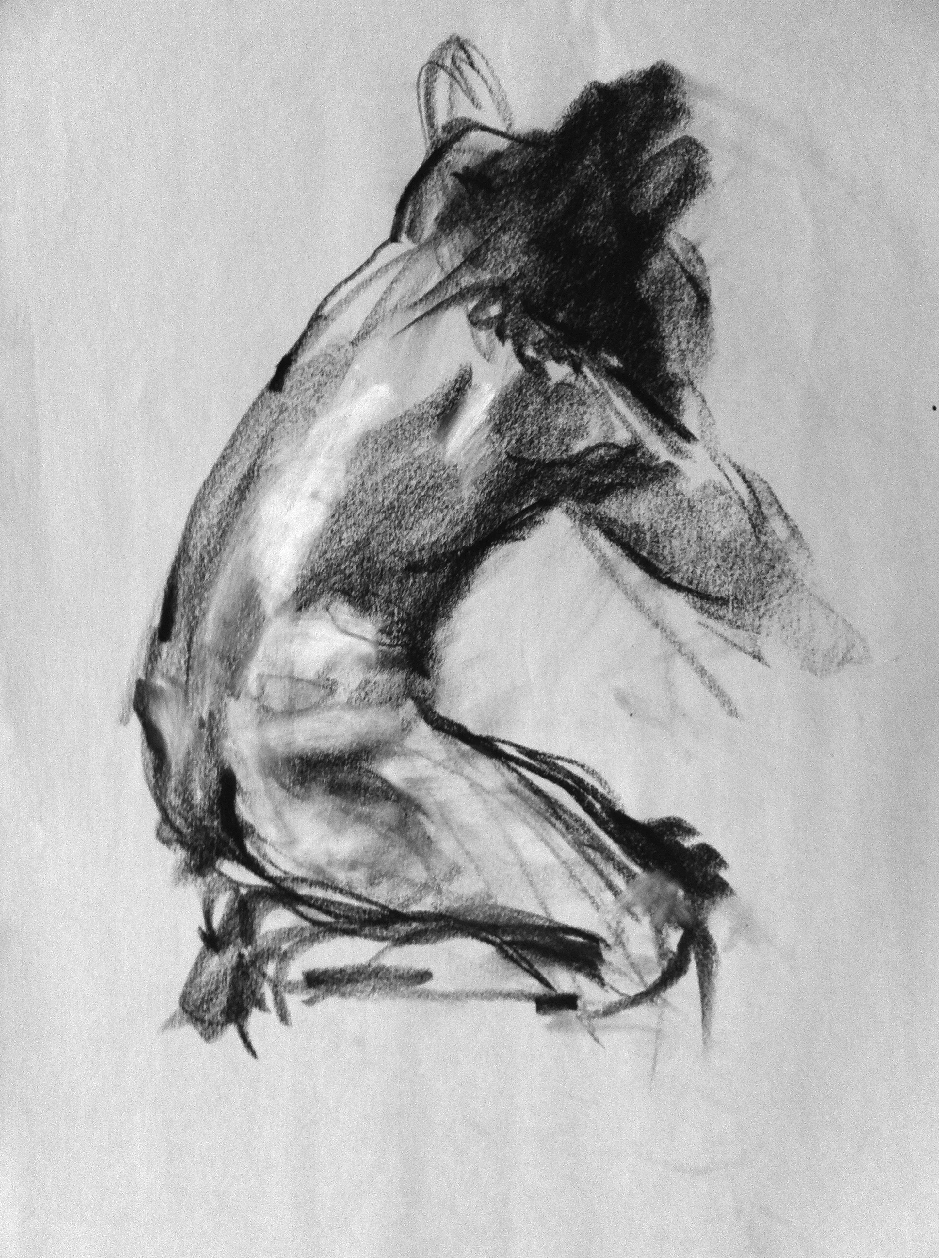
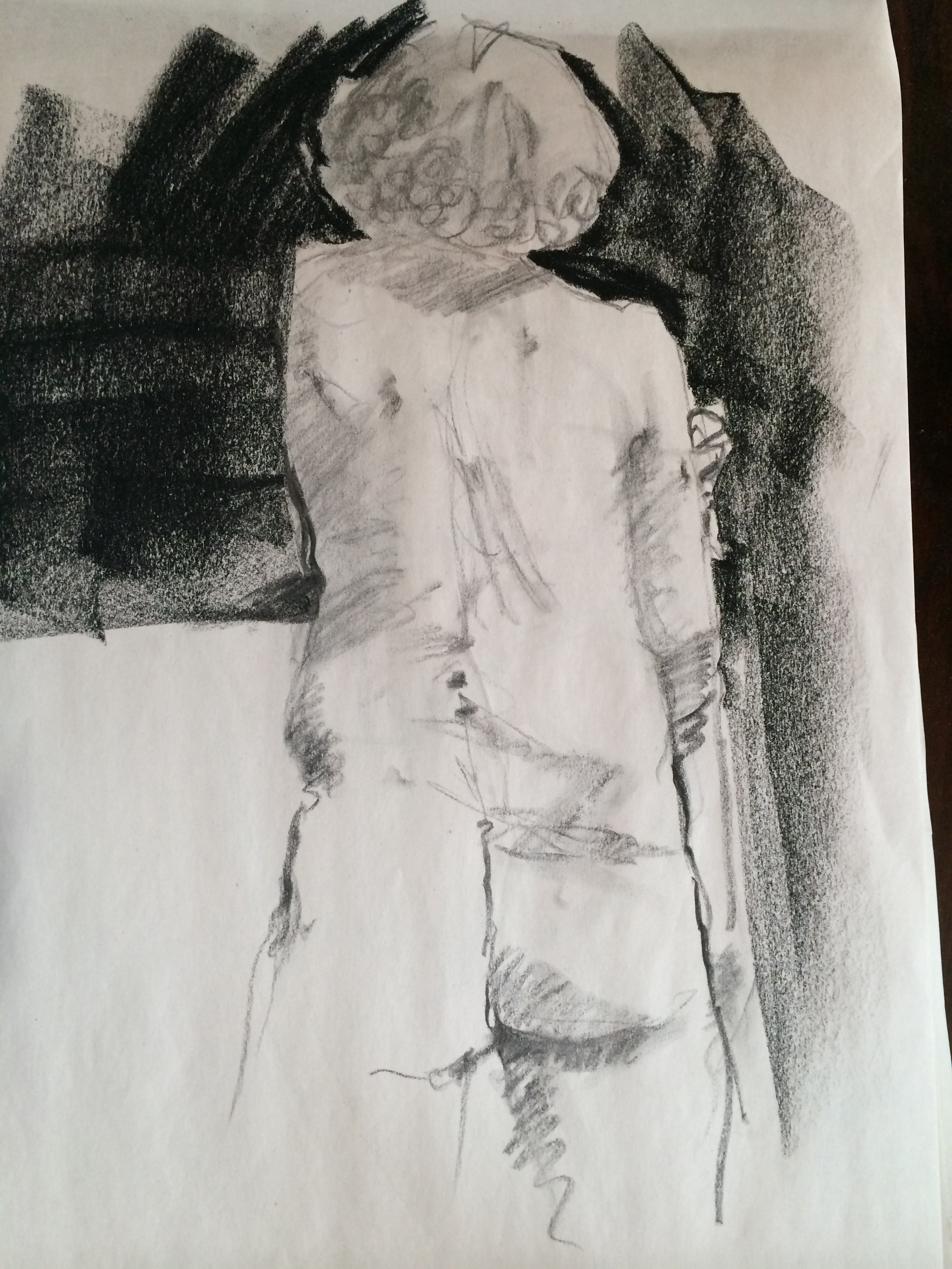
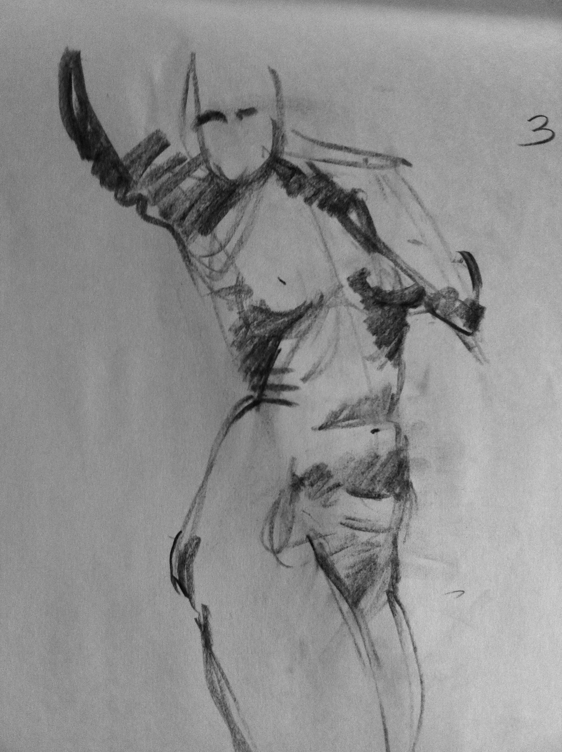
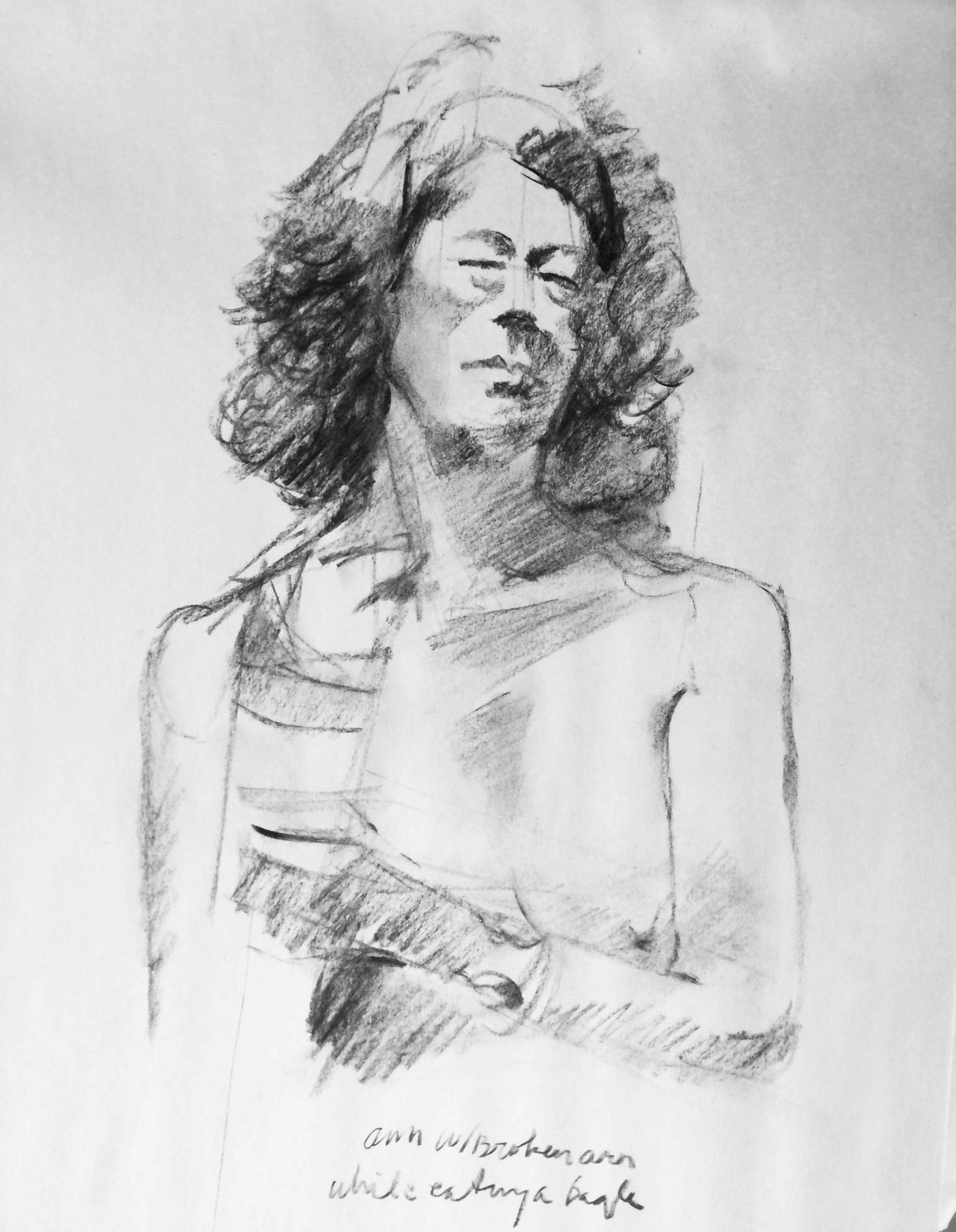
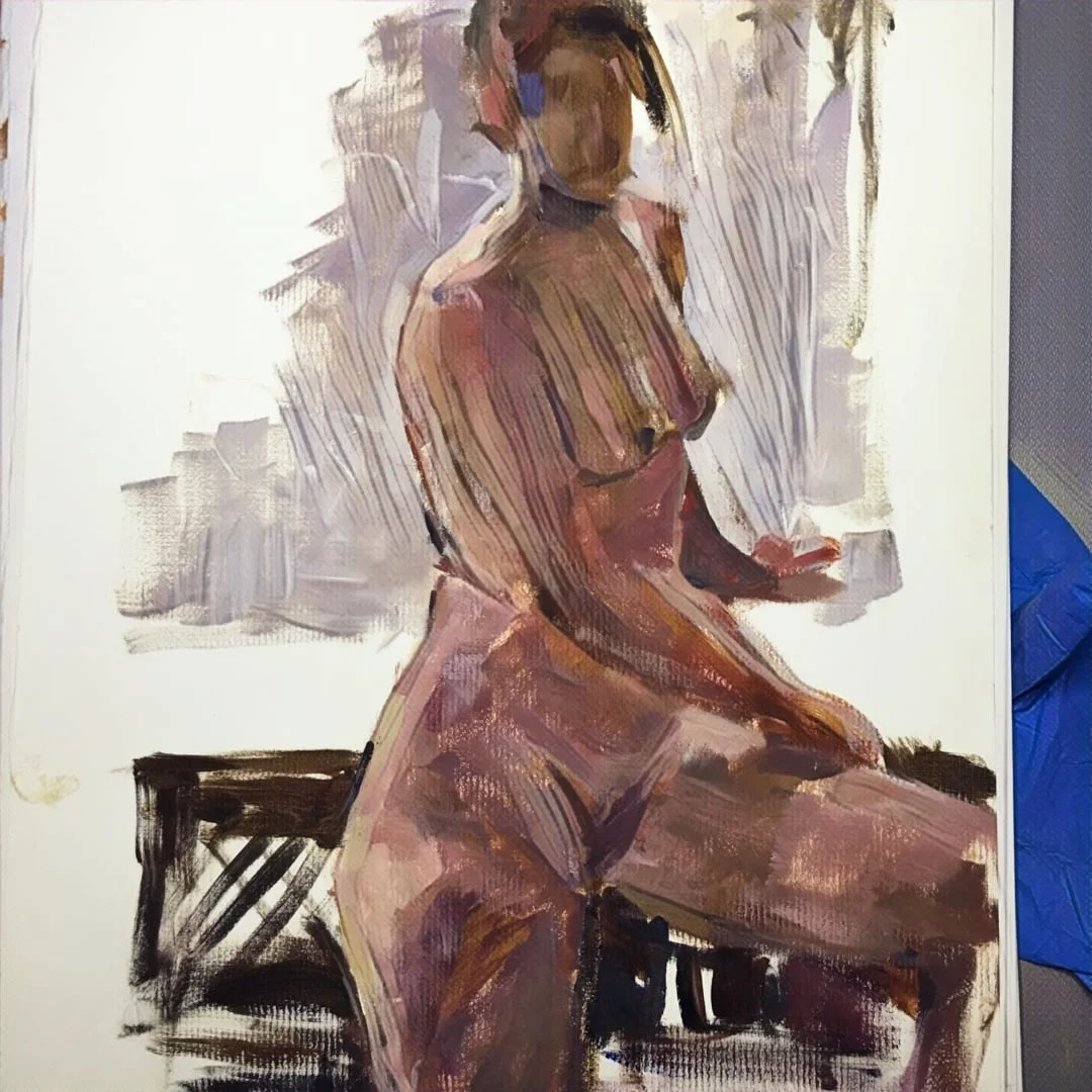
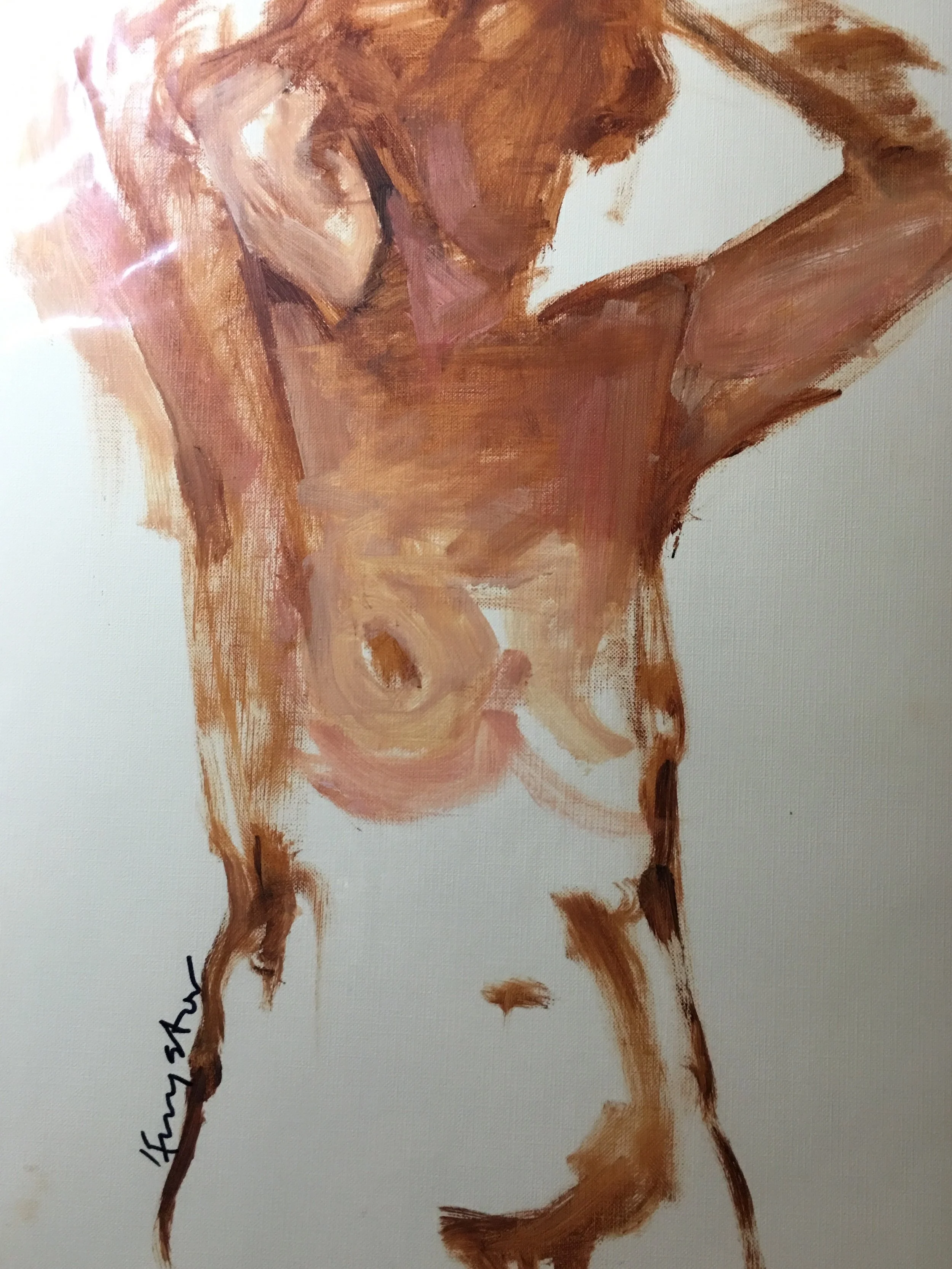
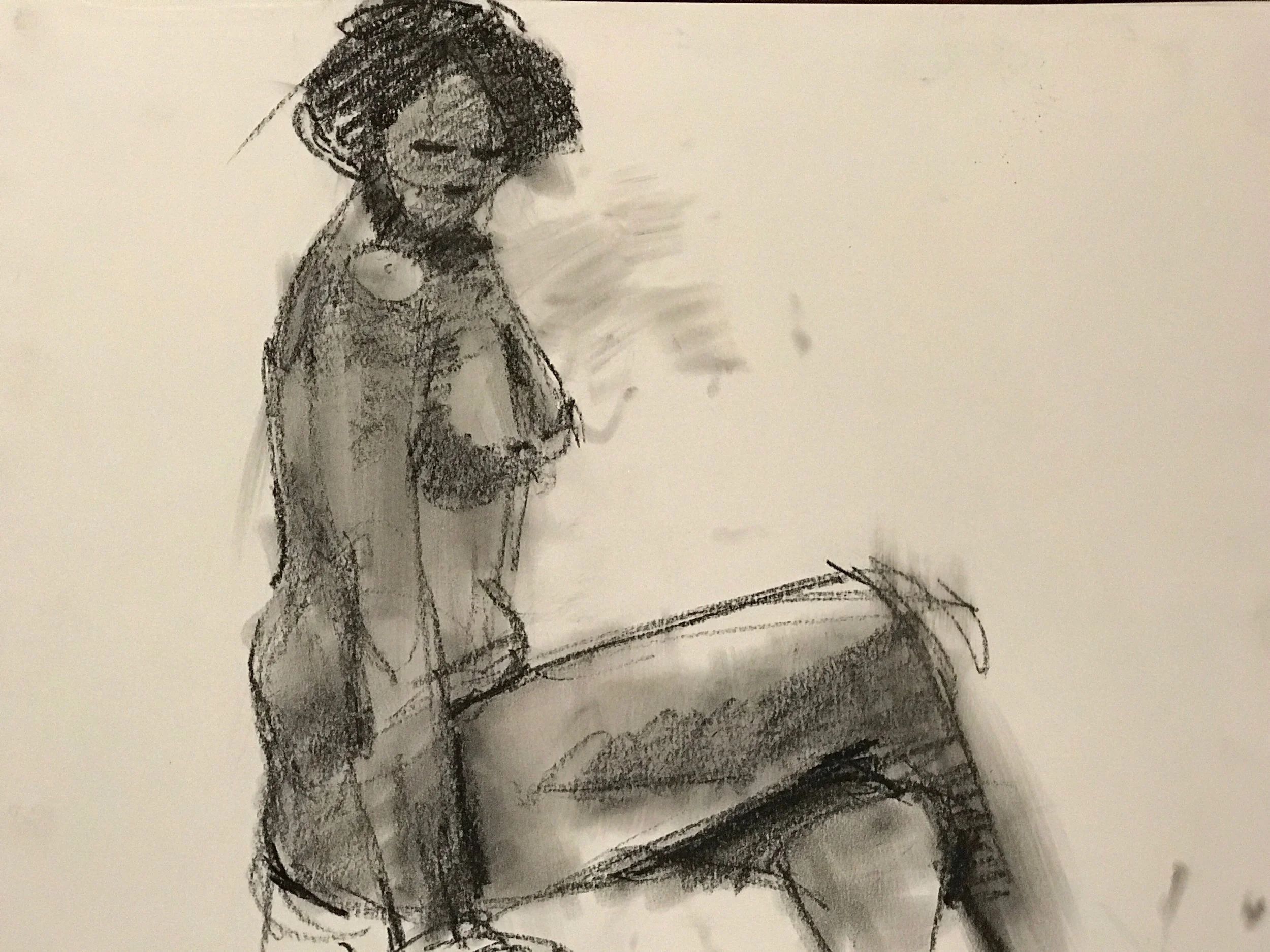
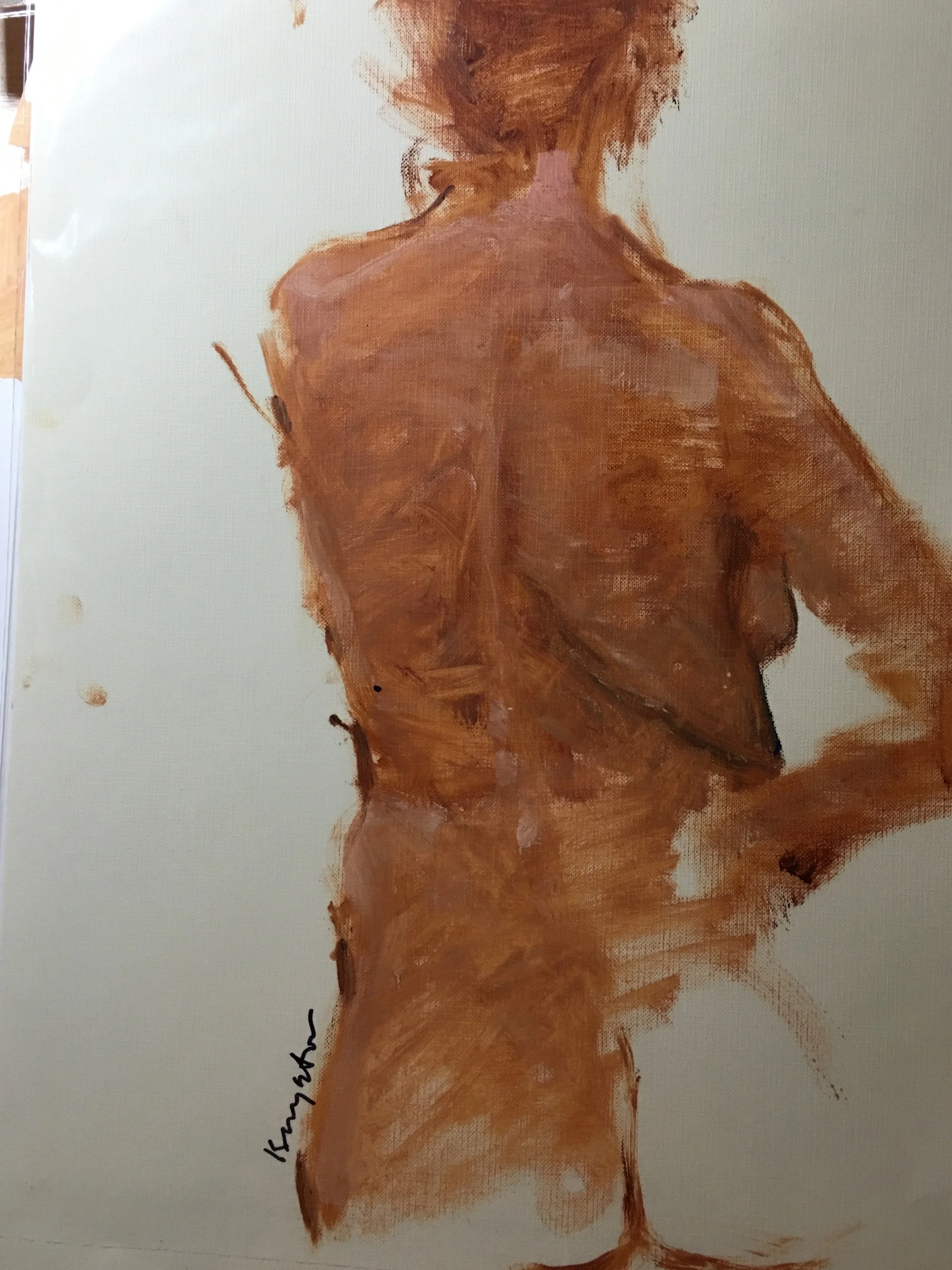
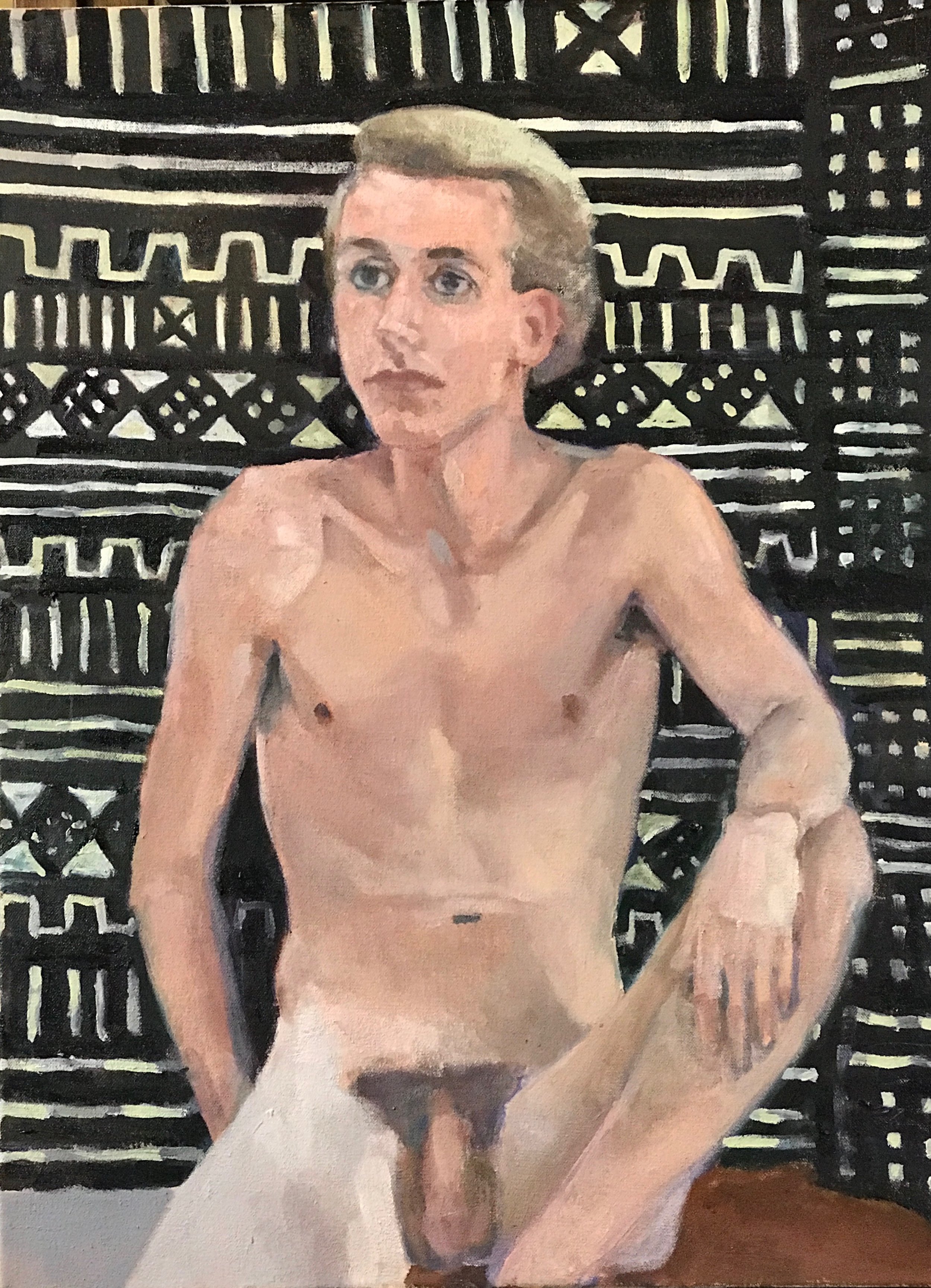
For the past three plus years I have been painting every week at Johan Sellenraad's studio with Johan and Judith Reeve. Other artists will often join us but the three of us have painted most every week from the beginning. Over that time we've had six or eight different models. For the past 2 years our model has been Catherine.
We have formed a sort of collaboration. Sharing ideas on color, style and composition. We each have a different style to our work. We influence each other through selection of pose to the mood of the sessions. I have been strongly influenced buy both Judith and Johan. Johan has changed how I attack the canvas with the influence of line. Judith has opened my eyes to structured color. One day I'll fit the whole figure on the canvas;).
This August we are having a show at the Delaware Valley Art Alliance in Narrowsburg, New York . An exhibition of three very different artist's paintings and drawings. Working from one model for over a year. The show will run from August 17th to September 15th in the Loft Gallery at DVAA. With an Artis's talk on August 21st and DVAA Gallery.
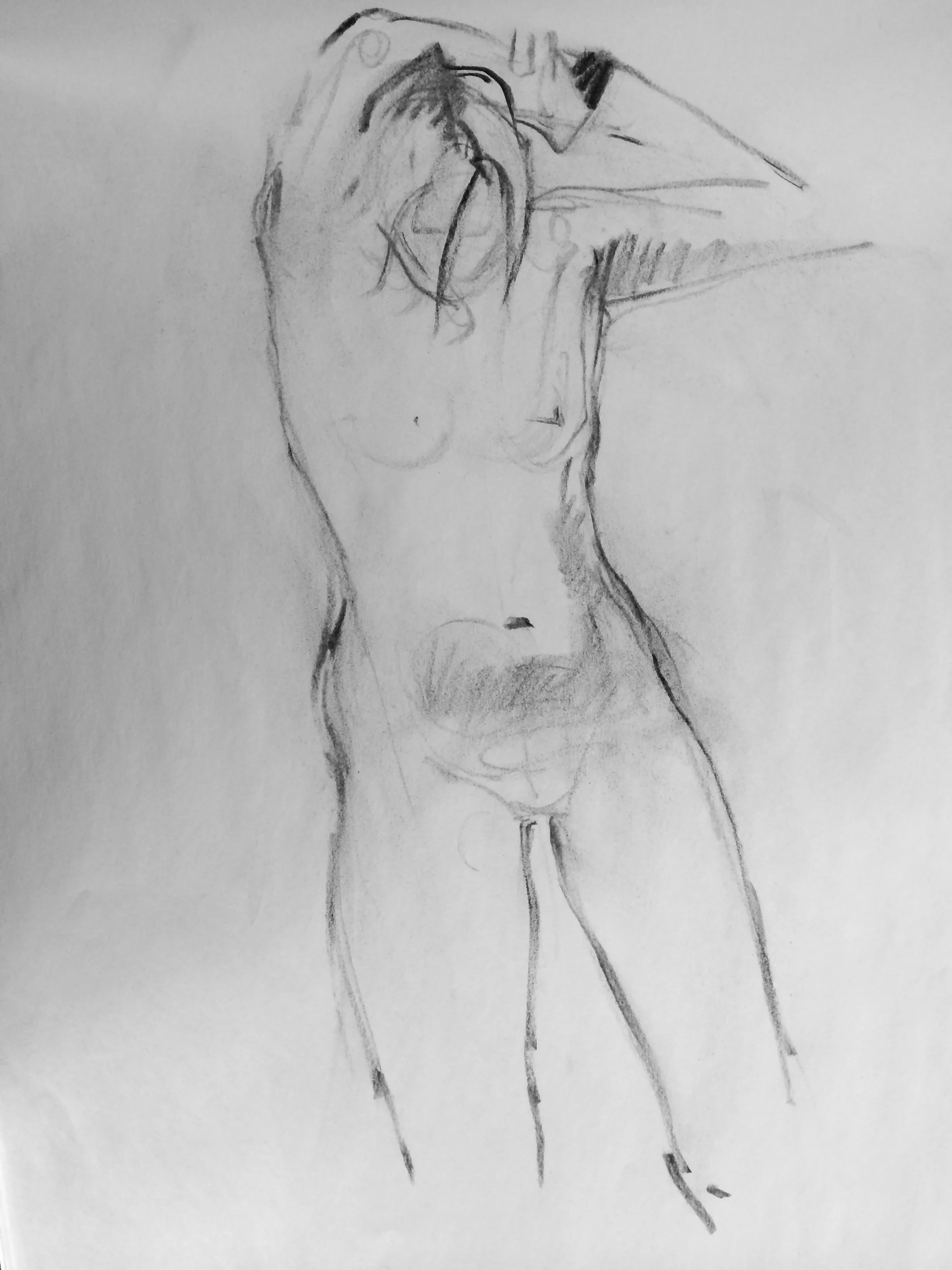
Catherine. Never a bad pose. Always graceful in gesture. Without her there would be no show.
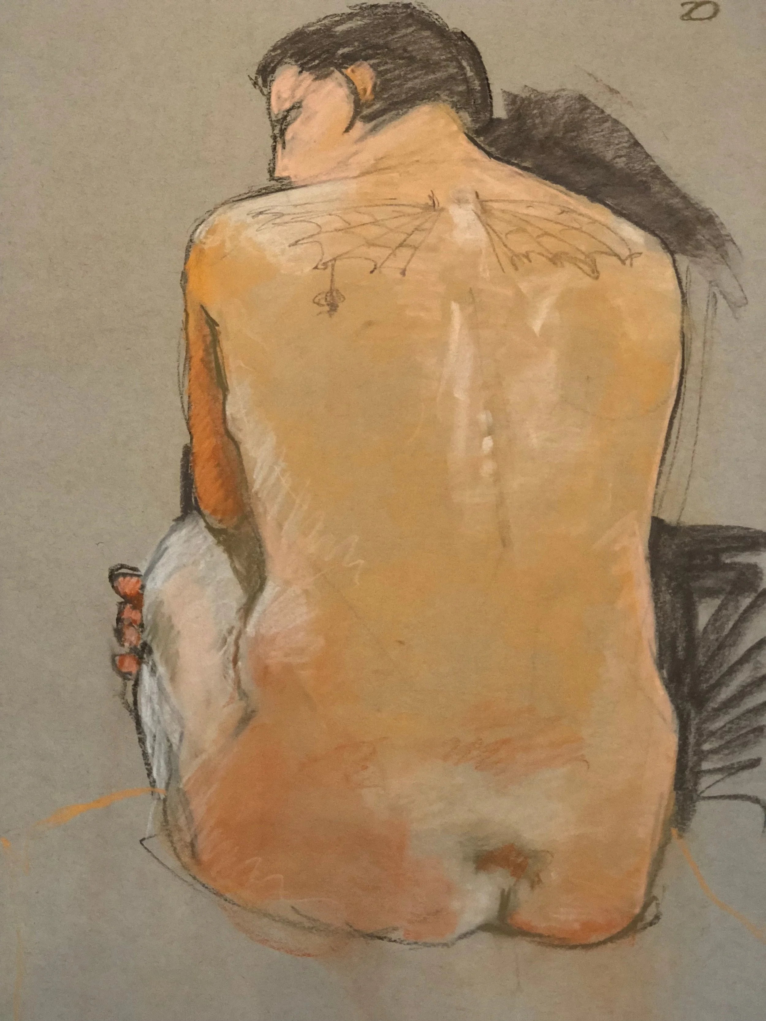
Johan Sellenraad. Eurynome's Revenge '17 48 cx 42 o/c
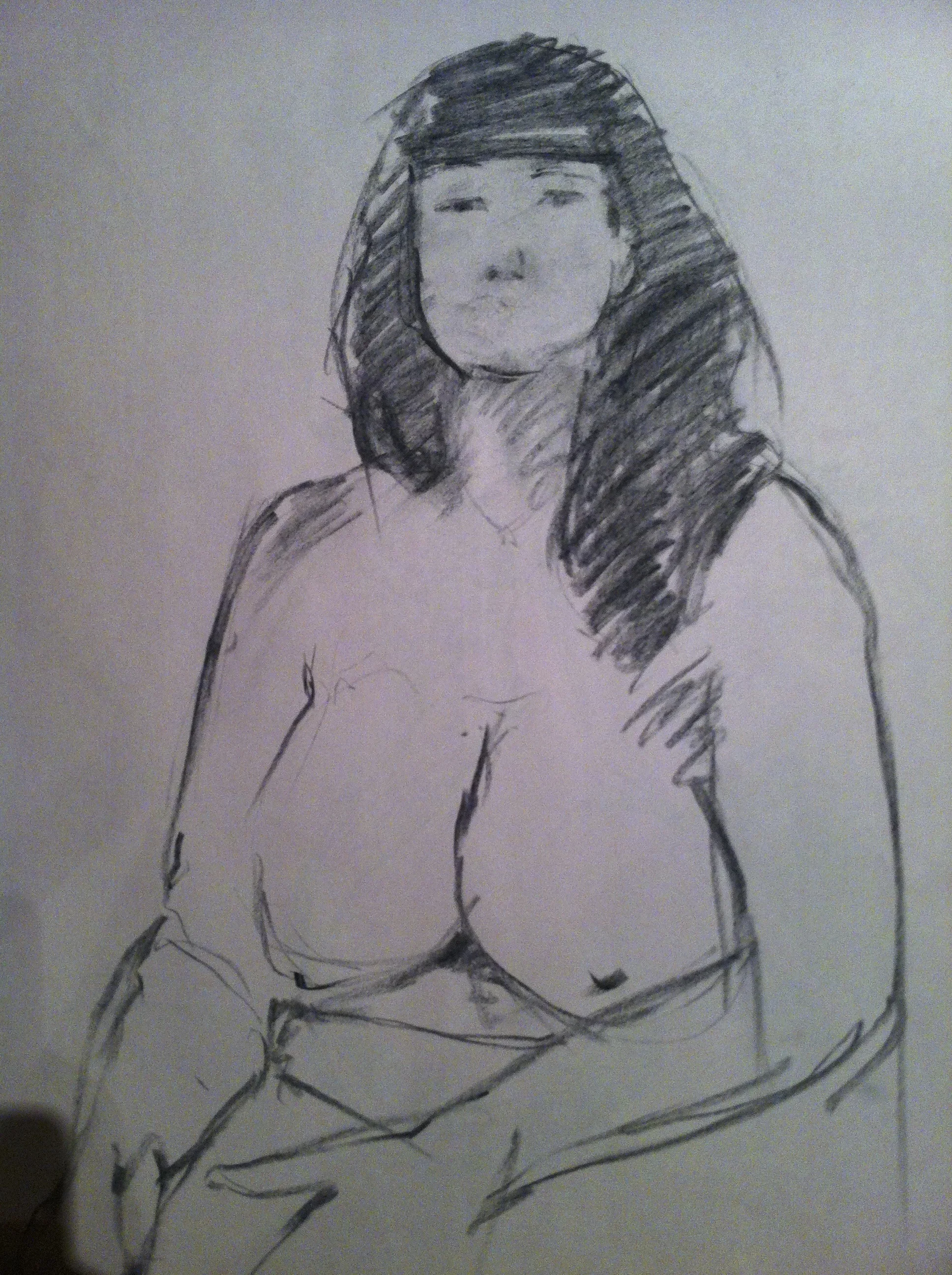
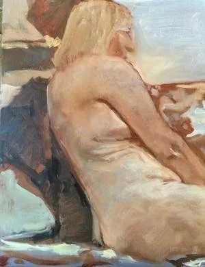
Judith Reeve. Nude on Gray 18 x 24 o/p
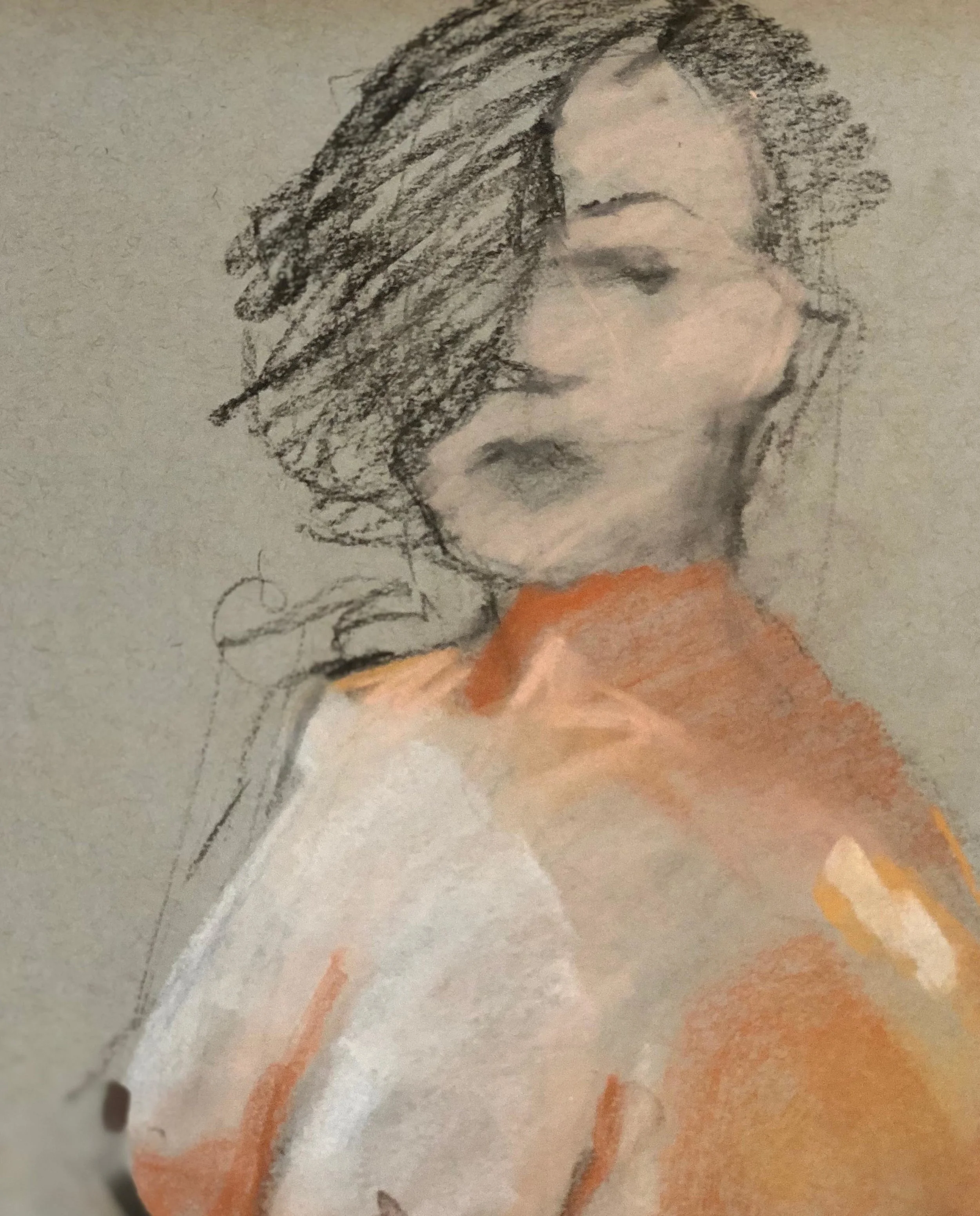
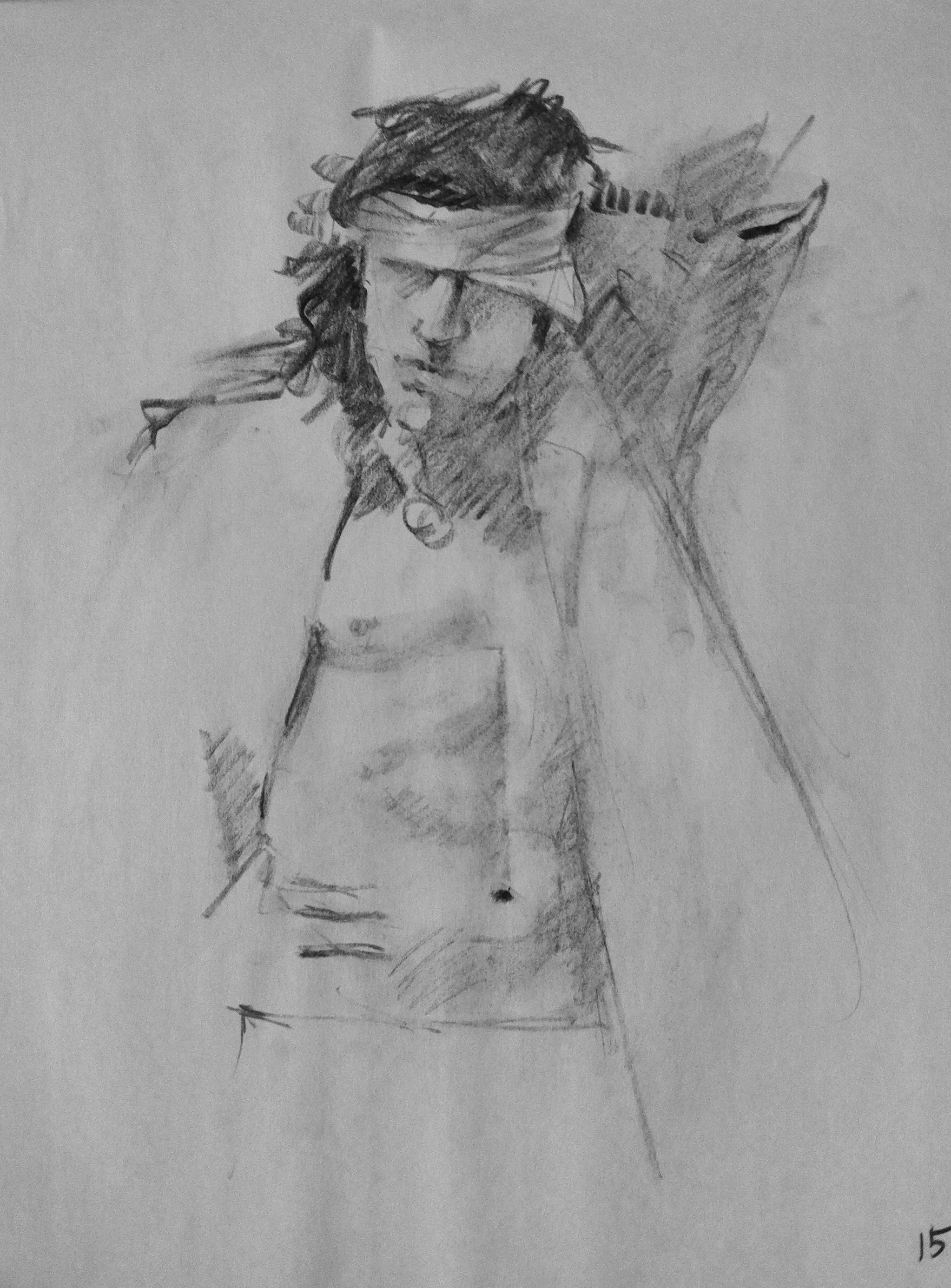
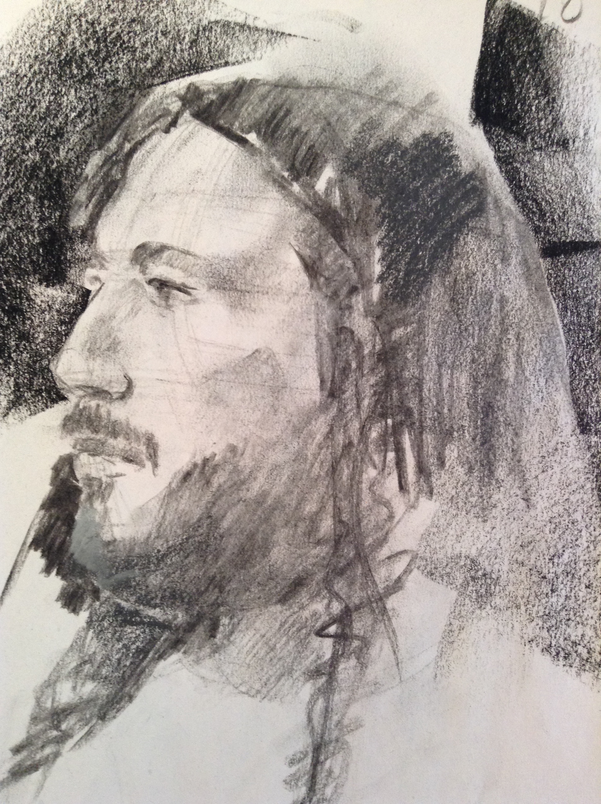
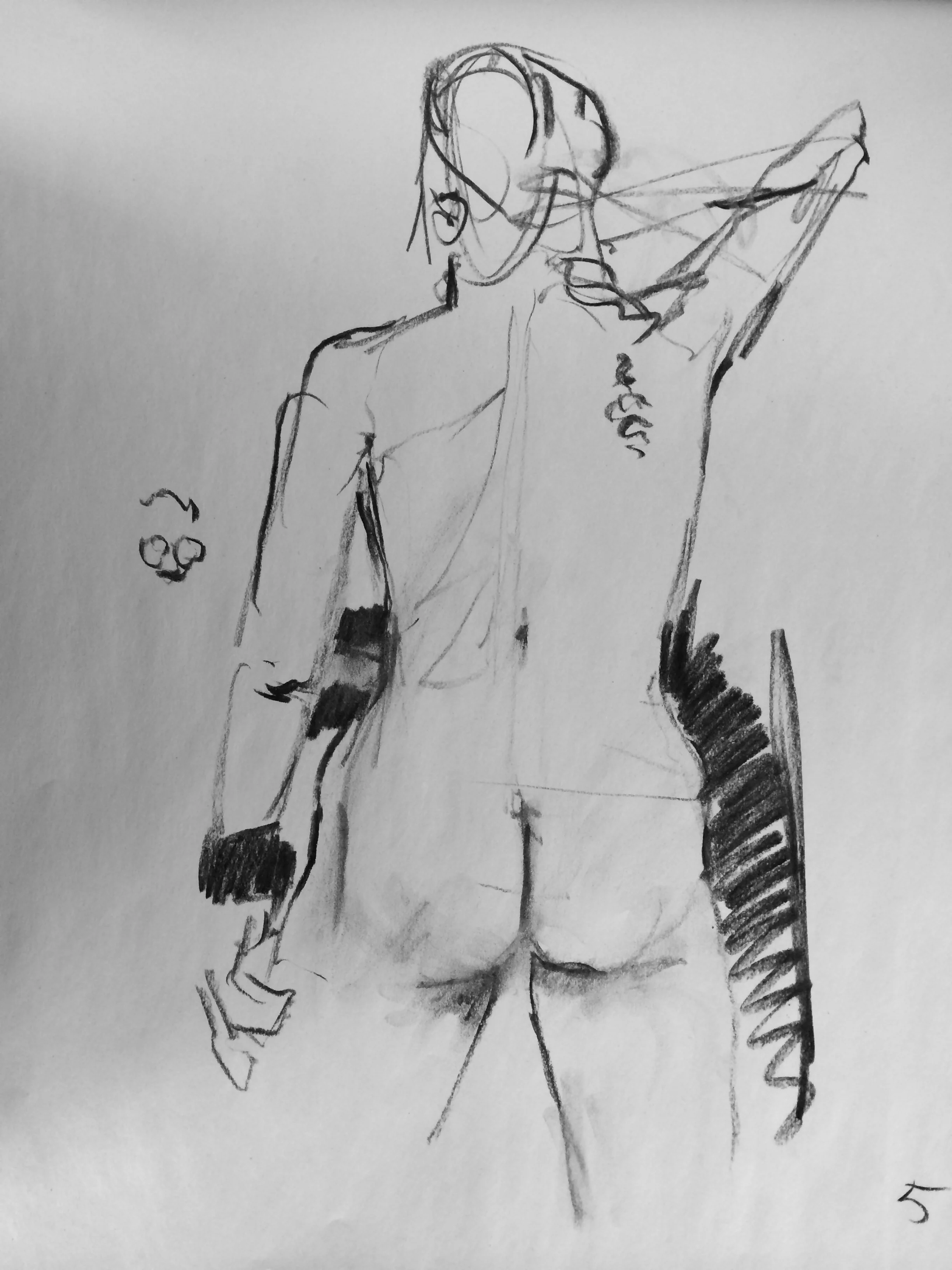
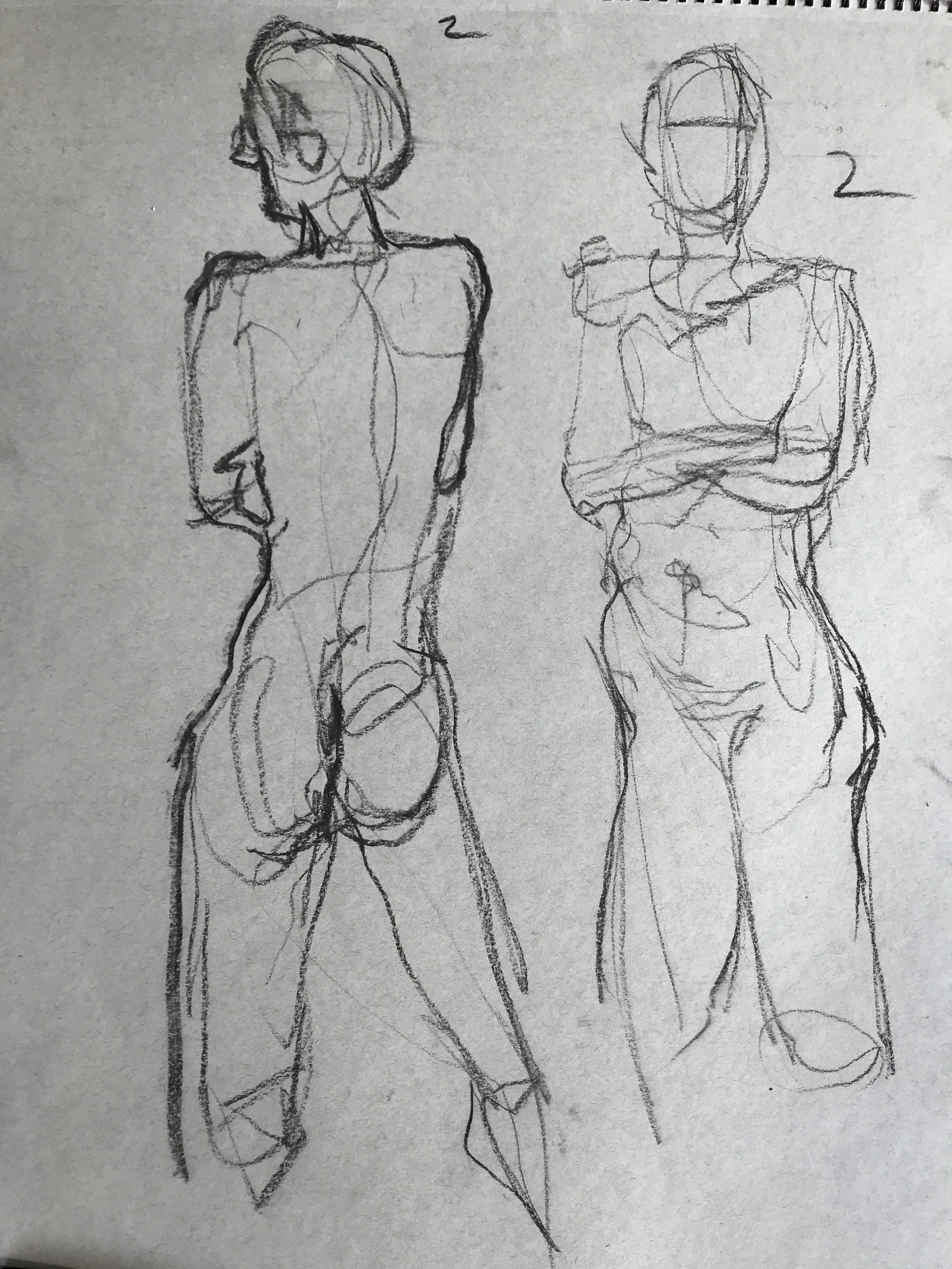
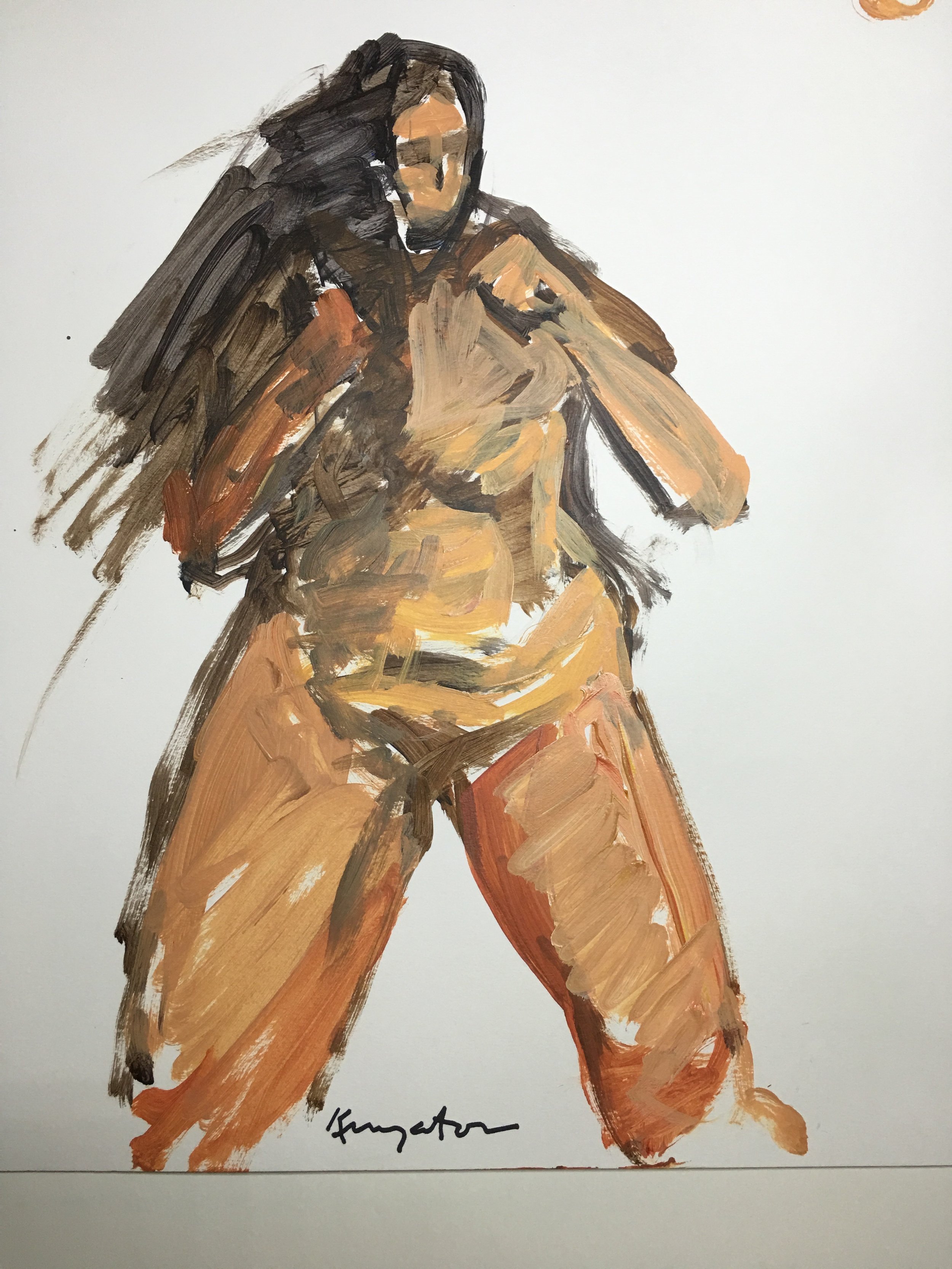
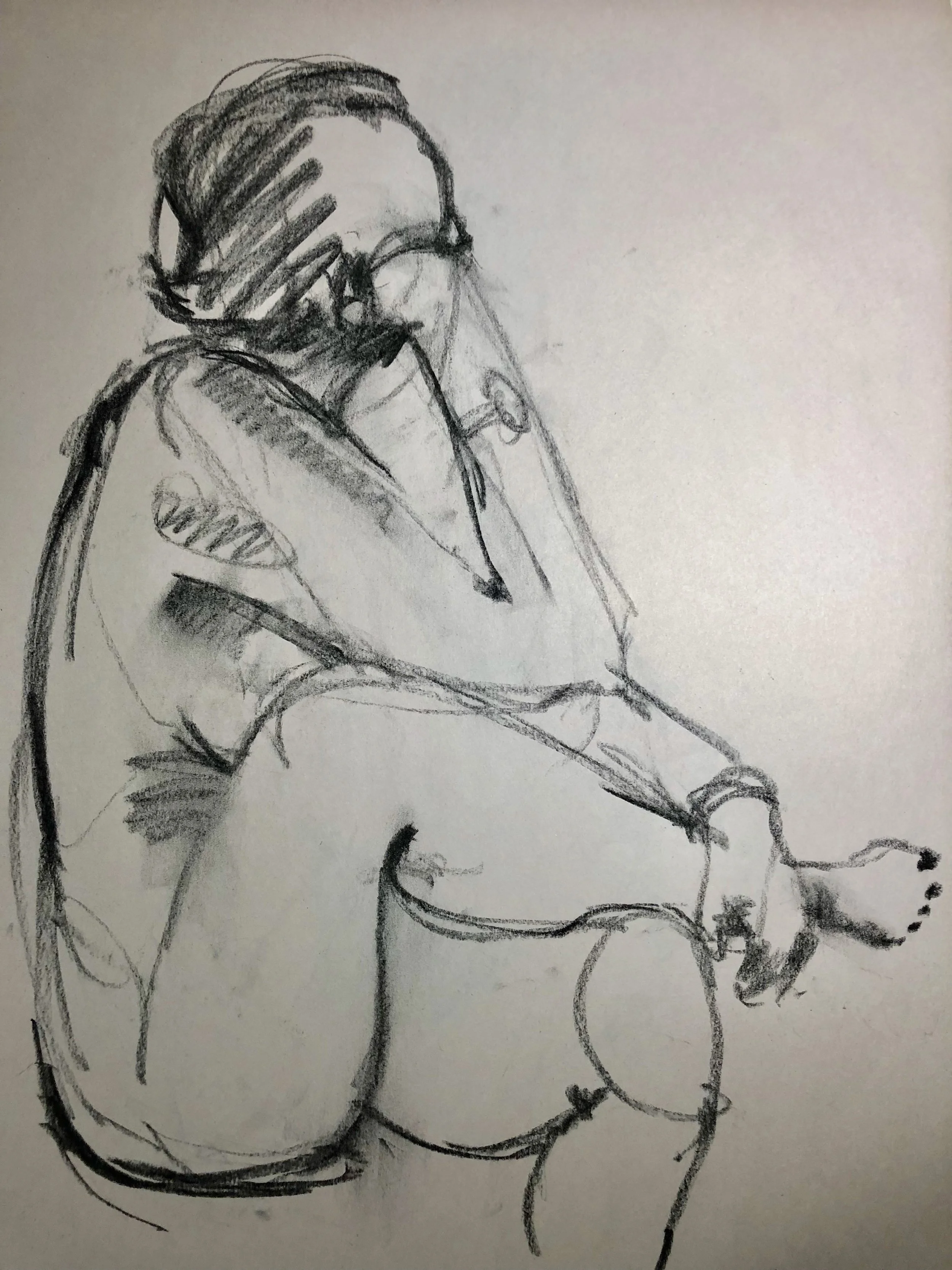
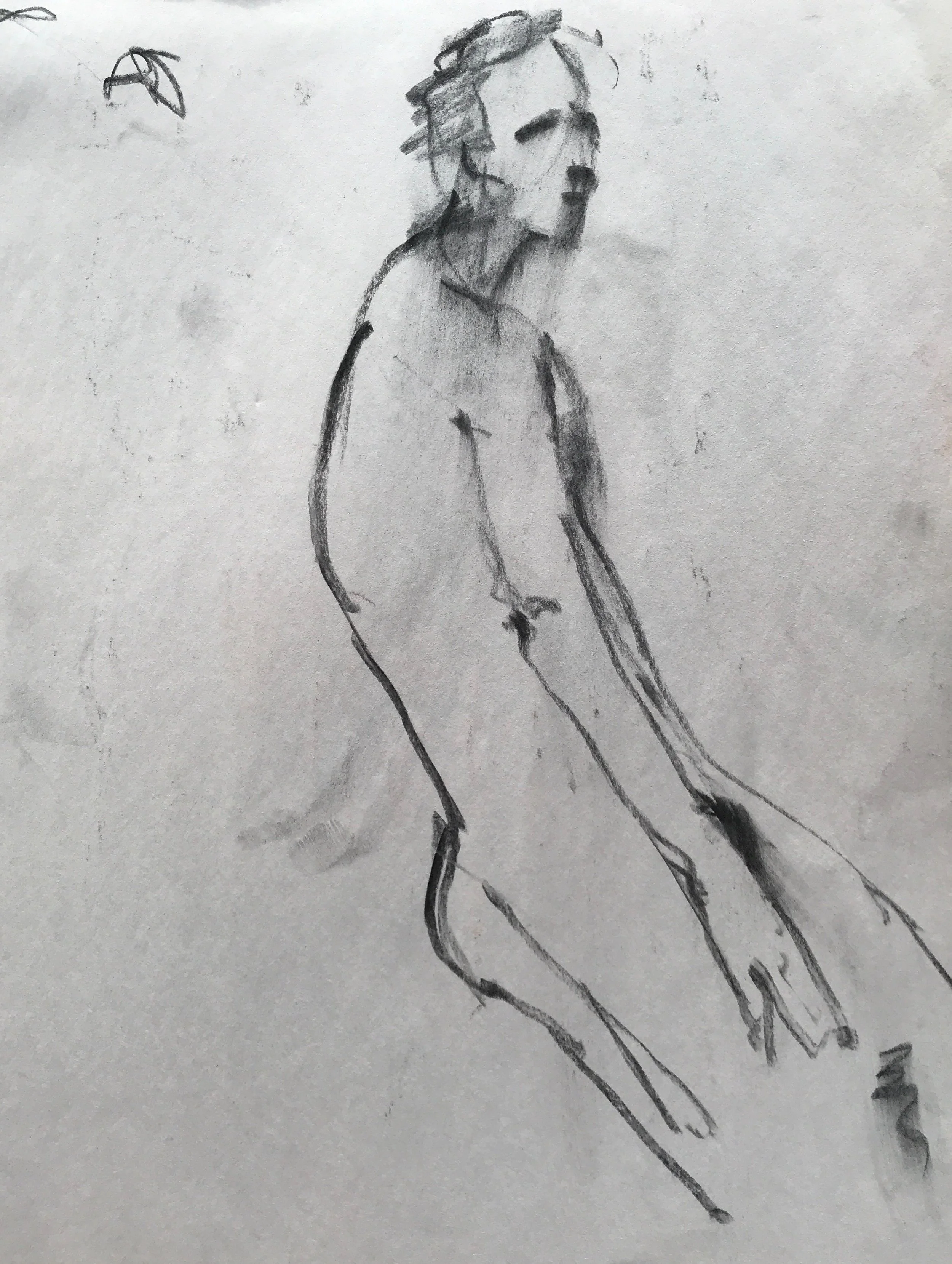
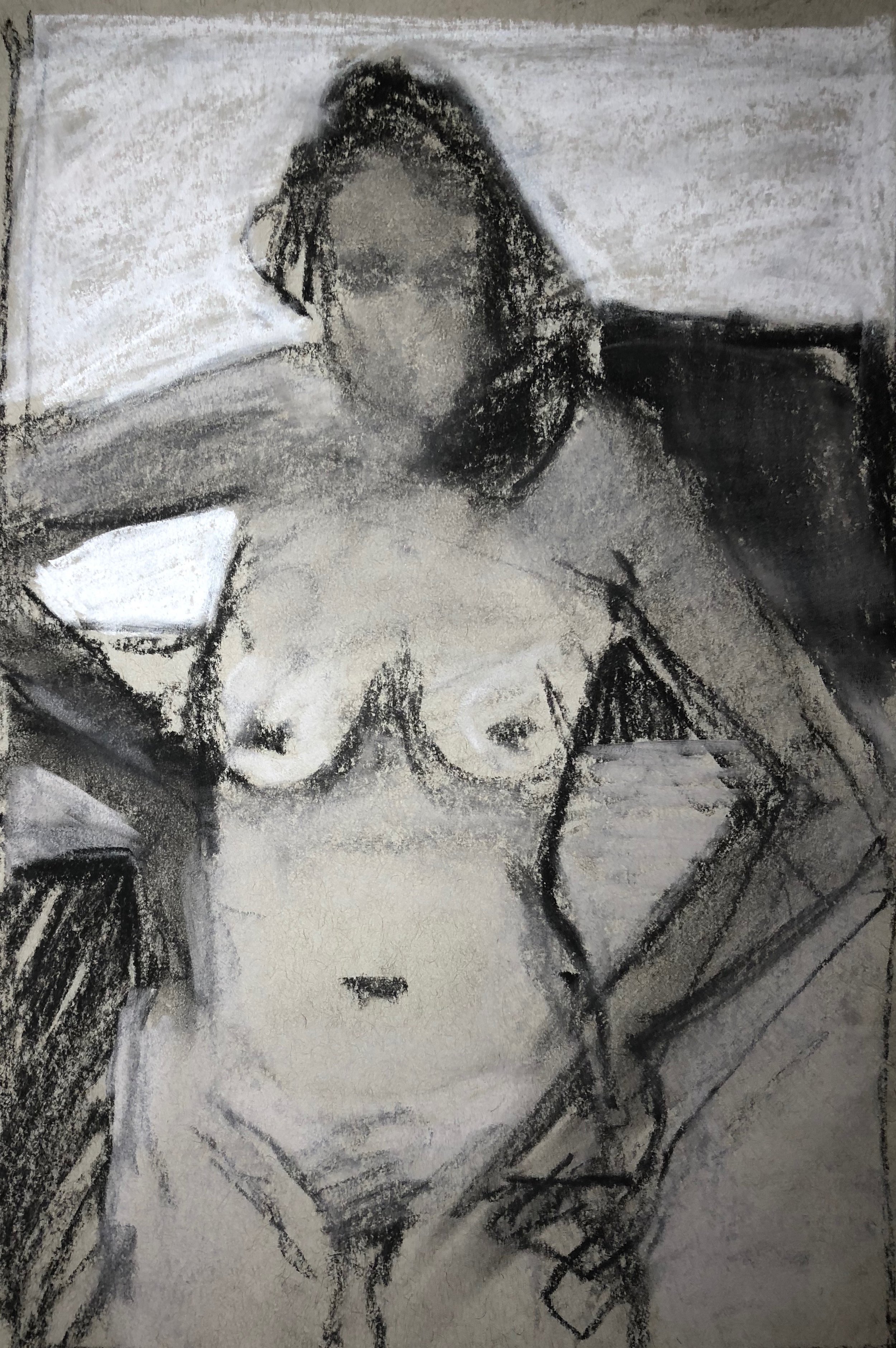
Jim Kingston. Seated Study 24 x 18 chalks on bristol
Finishing another piece for our show this summer : Catherine 3 artists 2 Years 1 Model at DVAA loft gallery in August 2018. Myself, Johan Sellenraad and Judith Reeve.
Finish 4/30/2018
Black and Blue WIP oil on linen 36 x 24
It's a show of our work over the past 2 plus years with our principle model Catherine. Never a bad pose.
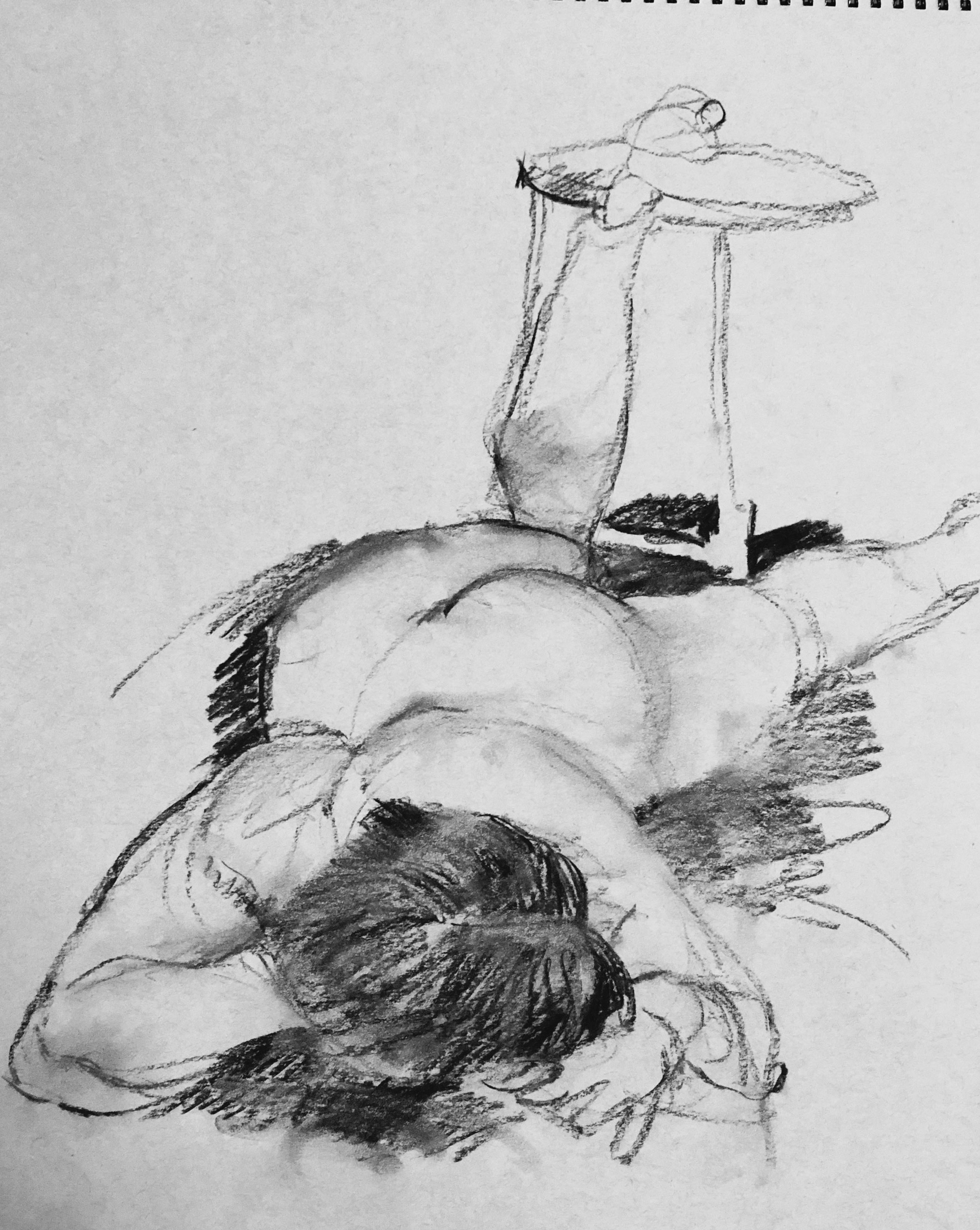
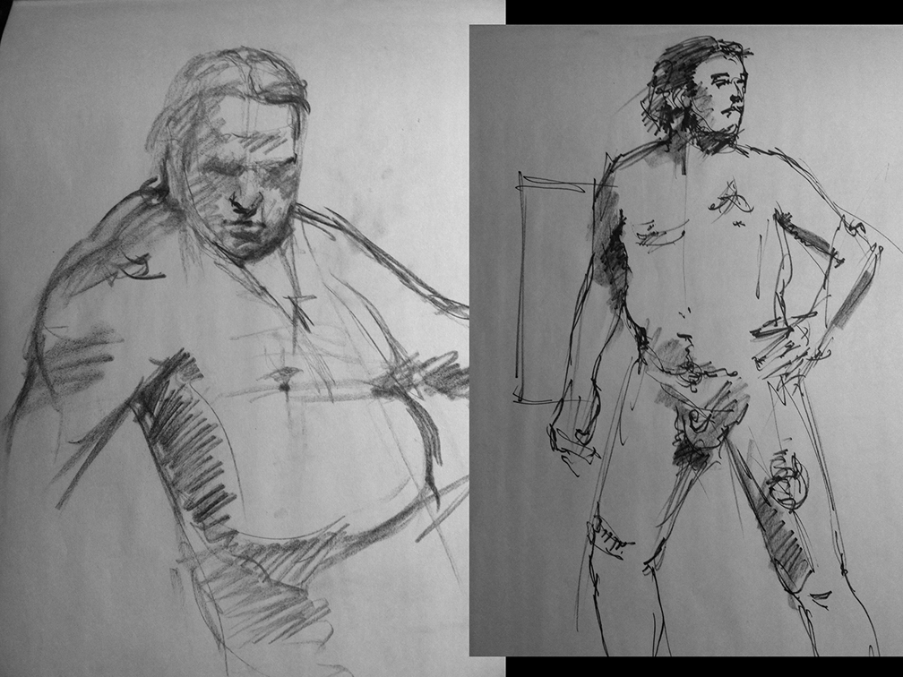
Over the past 4 years we've been very lucky to have some terrific model here in the Upper Delaware Valley. This is Corrine from the latest session at Pauline's first Tuesday drawing social. these are 1 minute to twenty minute poses. A tremendous model. An athlete artist. Her poses are classic and inventive.
Working from life has become pretty much normal now. Working with models is the best part. The figure contains all the proportion, perspective and spacial challenges you need. It requires energy and some on the fly imagination
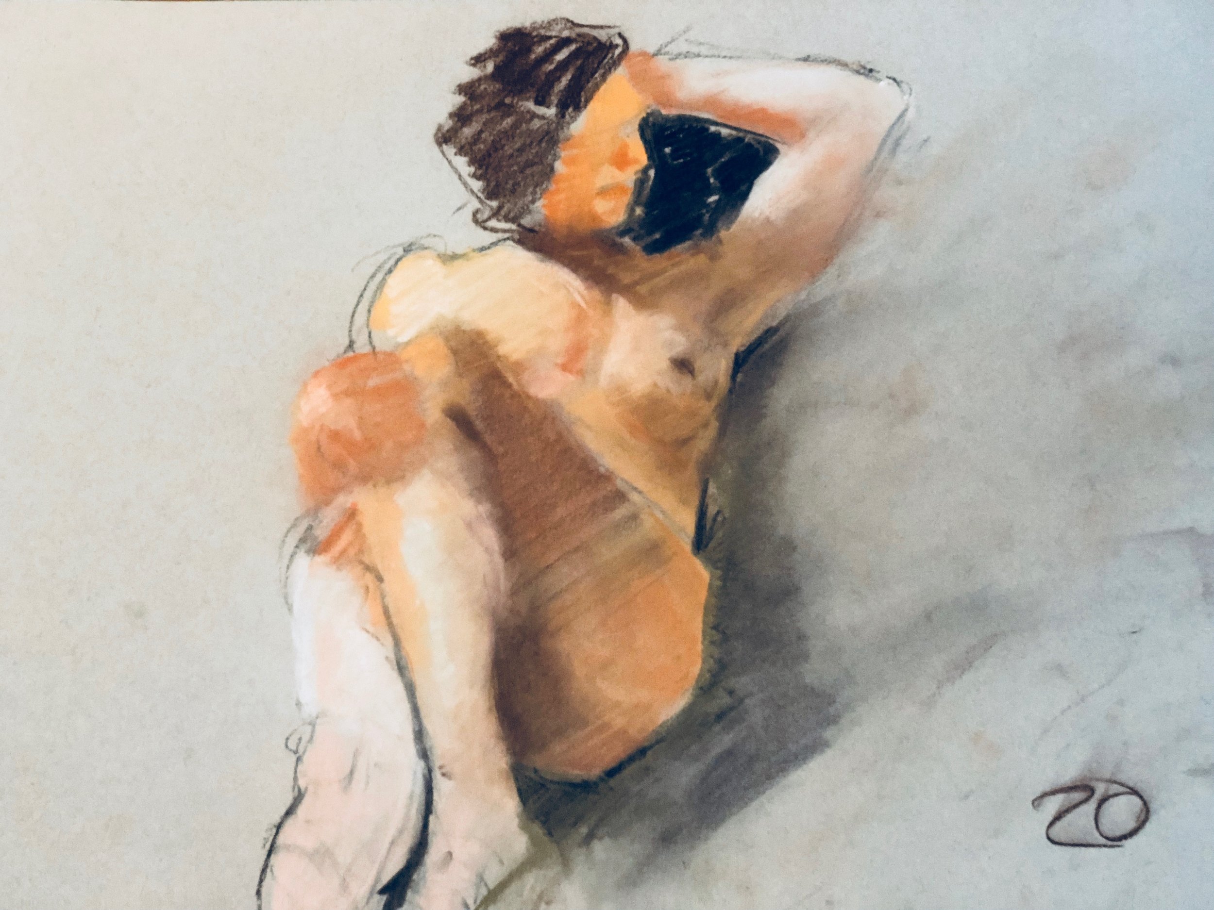
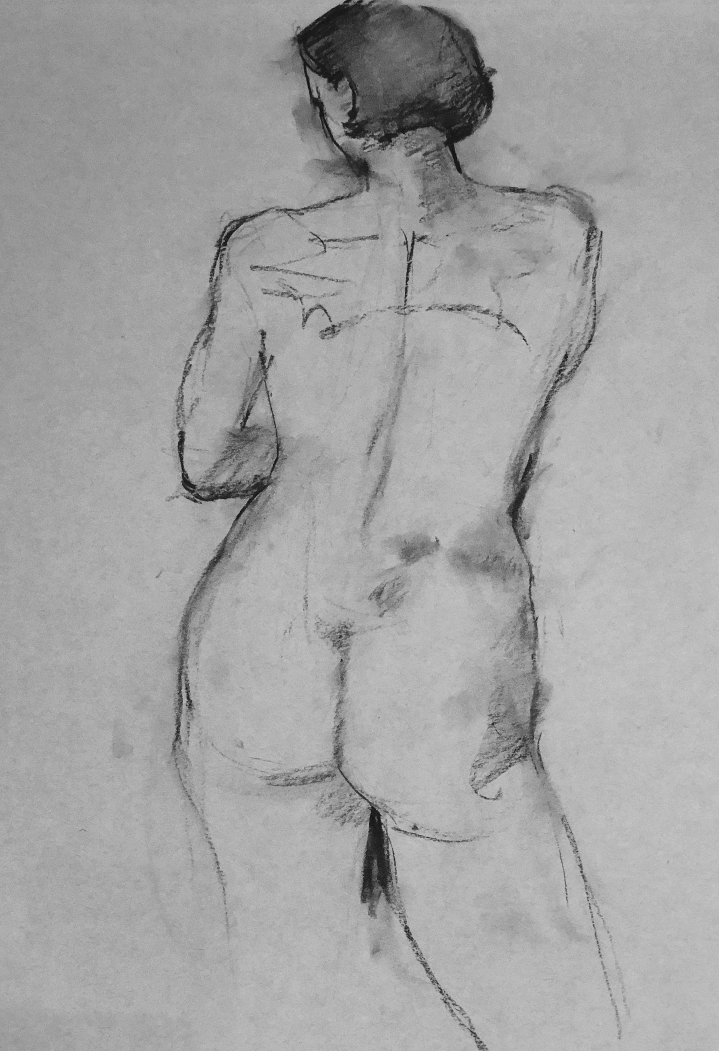
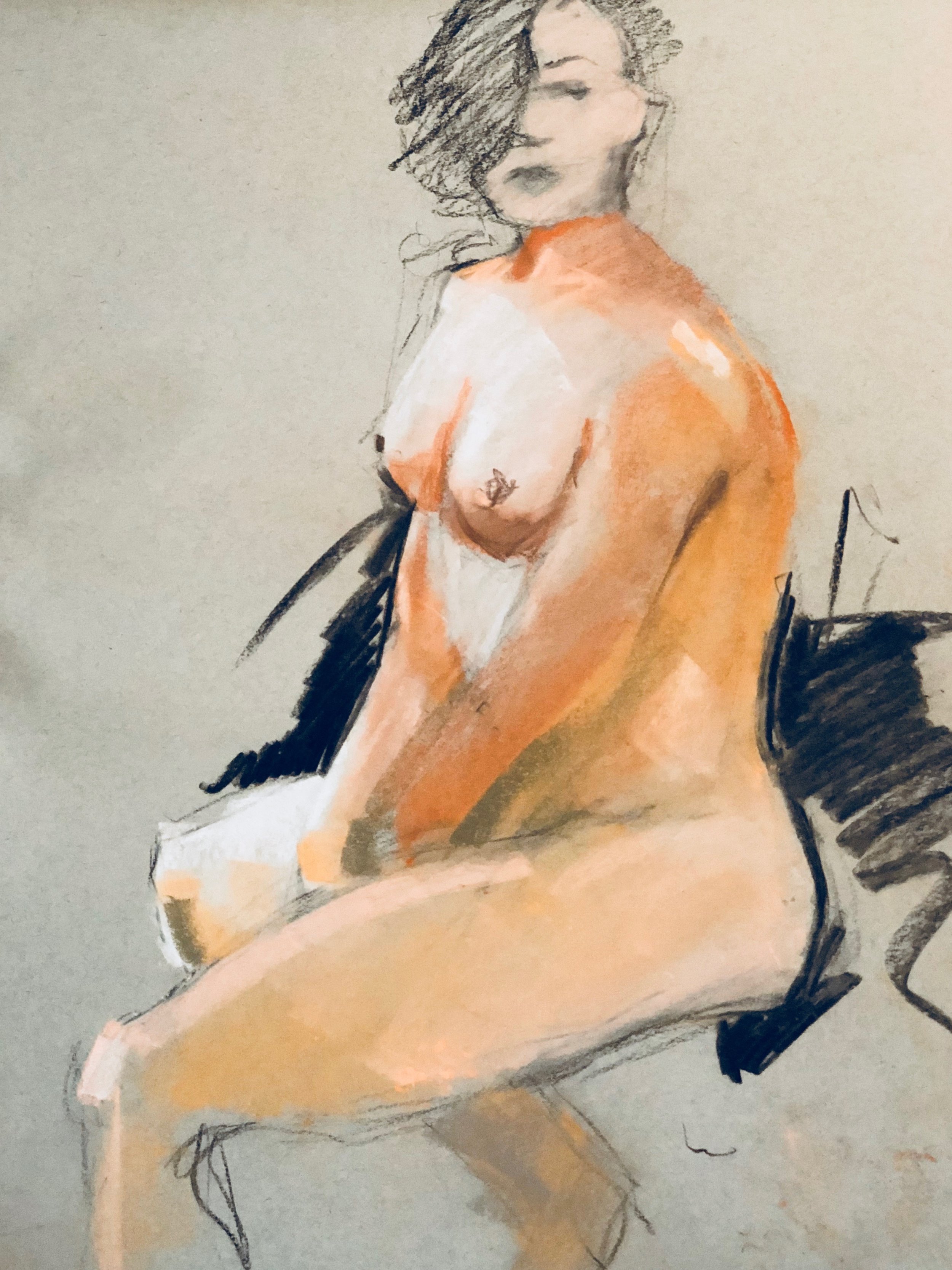
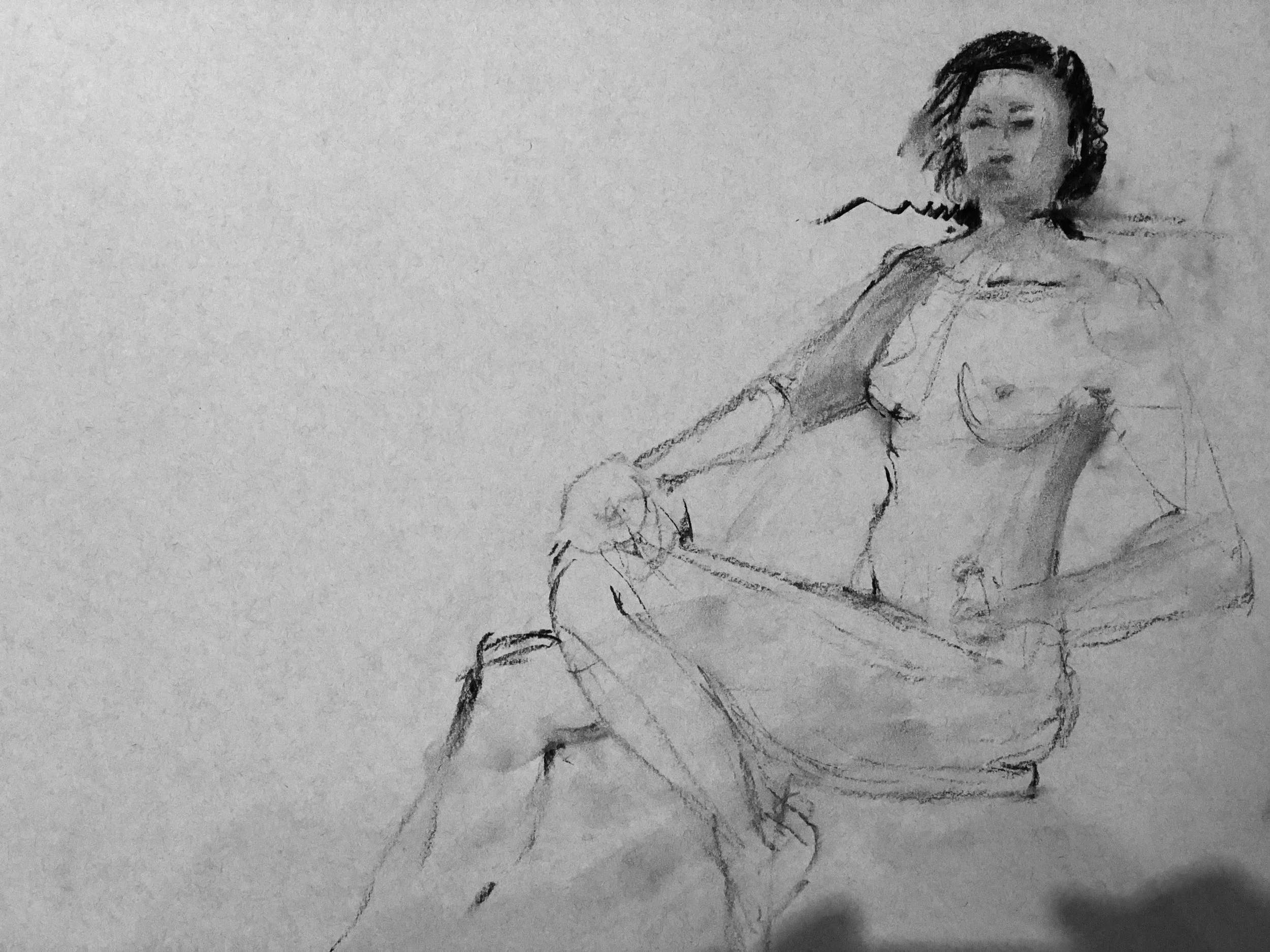
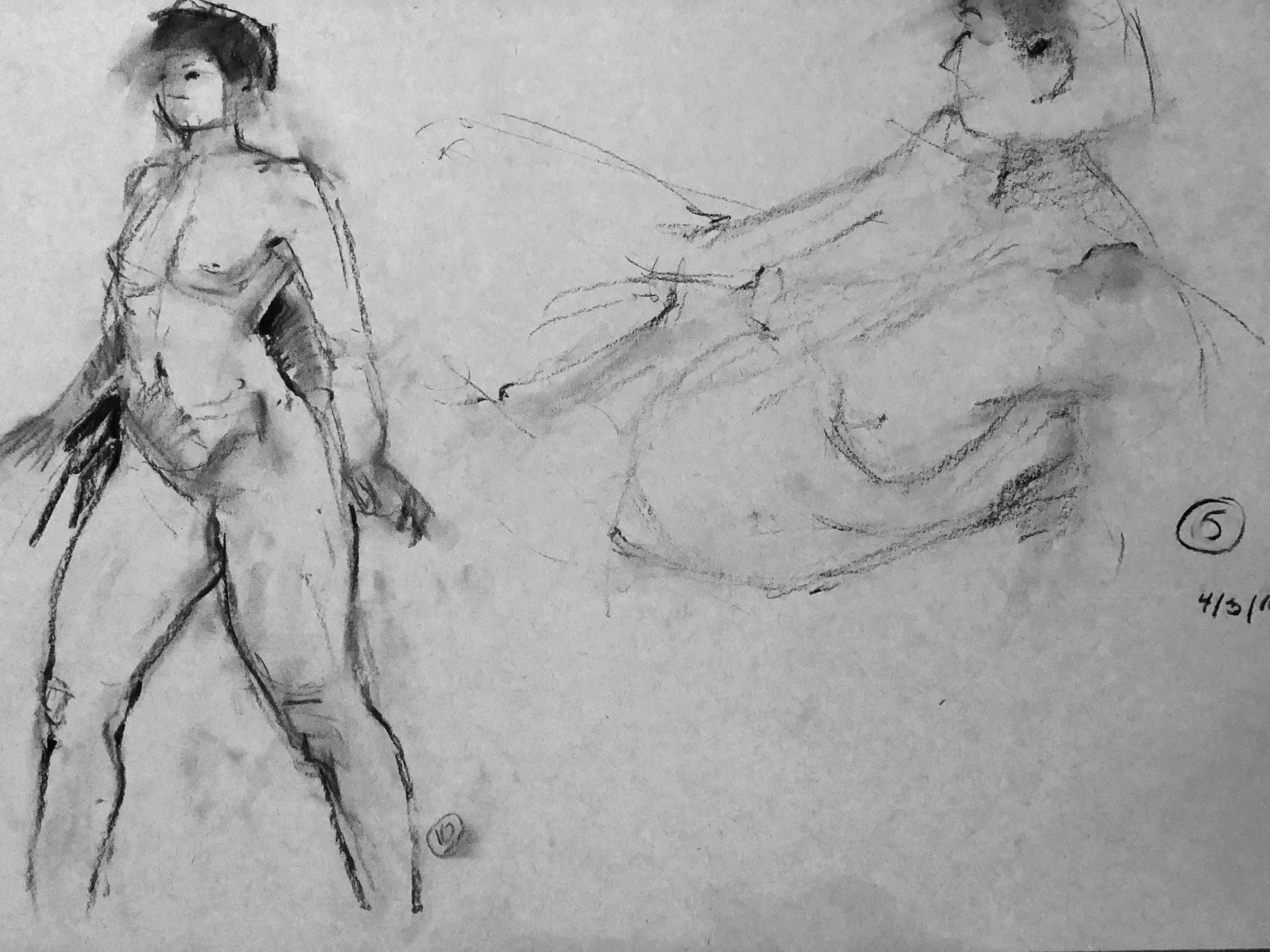
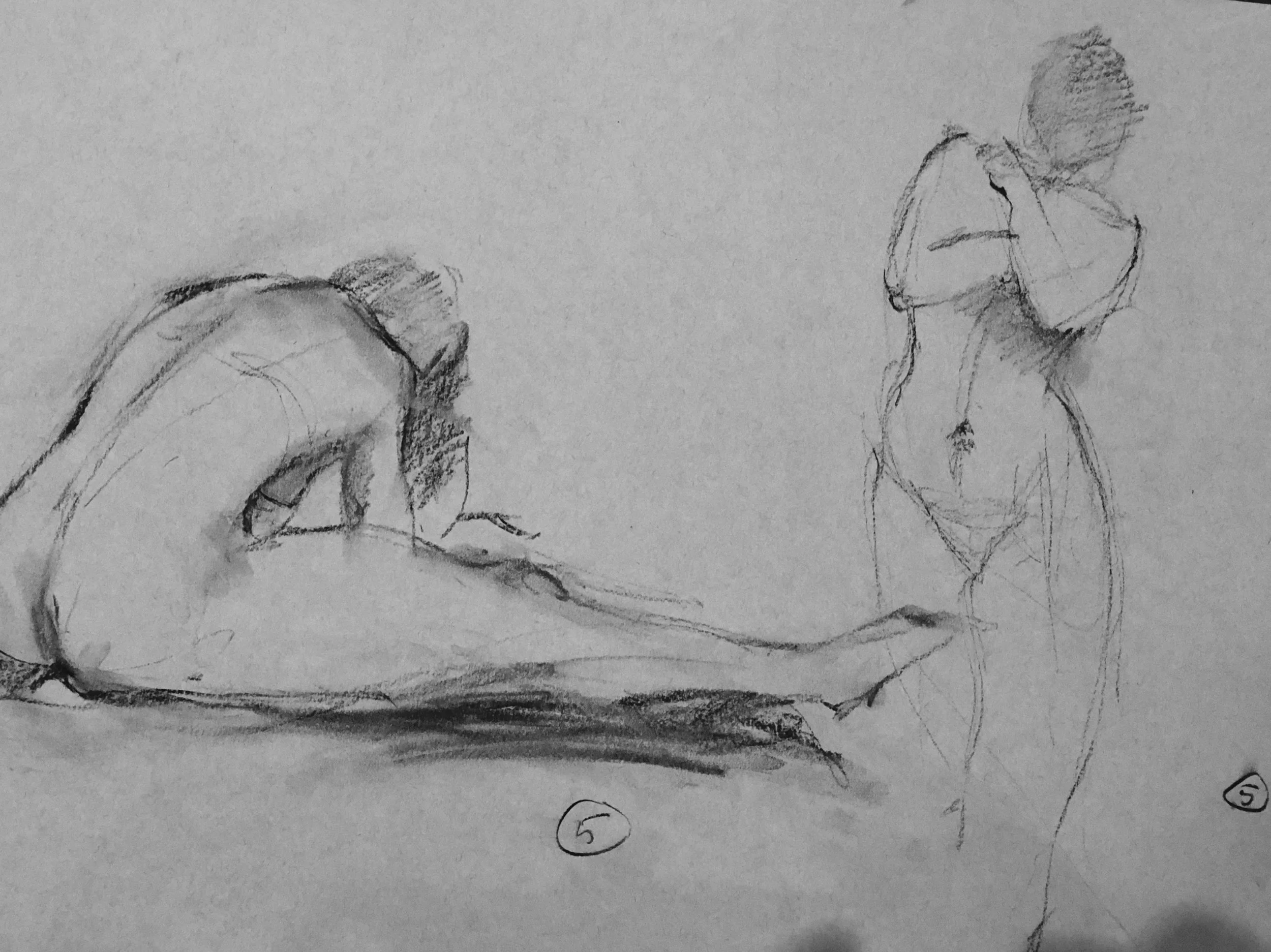
Of course there is the majestic Catherine who never strikes a bad pose. Who Johan, Judith and I have been painting for the better part of two years.
There is Justin, Marie Louise, Racheal who was Ianni's favorite, Dianne, Miguel, Mary, and Soha. And a bunch whose names I can't remember. The best part of being an artist.
This pear is painted with Geneva Colors mixed with Gamblin Cold Wax medium as were the cucumbers. The wax makes a wet and hard to manage paint workable and even pleasant. But thats not the only thing about this. This is the fourth painting I've done with my John Sloan inspired semi neural and neutral colors as my principle palette. Also my block in, underpainting, was done with acrylic paint. Fast and quick drying. The violet towel in the background with the orange stripe weaving through makes a nice secondary color theme of Green, Violet and Orange.
Another Pear 8 x 6 oil on panel 2018
Last summer we grew we grew a few vegetables in our little garden. Including these cucumbers. Early on they were great but then can a blistering hot dry period. Our well could only handle a little bit of watering.. so the early guys were the best of the season.
I painted this on a panel with Geneva oil paint. Which is a very loose paint with high pigments content. For me it's been hard to paint with. I found a material called Cold Wax Medium from Gamblin and thought I'd try to add some body to the Geneva paints with it. It worked!
Here's an iPhone shot off the near finish. Waiting for it to dry and then a layer of glazing.
In a pickle O/P 6 x8. 2018
Finally completed. It's been about 6 months of false finishes. The color is pretty much dirivitive of Sloan's color wheel. Mostly what he called Semi Neutral or Bi Color. With a little bit of what he called Hues. The hues are derived from the secondary neutrals. These are colors that I have tubed so that when I need them they on the palette and working for me. Mixing time is more focused. More time to see. I've been gradually moving into this neutral color zone for over a year now. As you can see these neutrals are pretty colorful. There are occasionsl full strength accents that pin the colors down. There will be more of this color technique for sure.
This weekend I attended Peter Fiore's 3 day painting workshop. I have been doing this over the past few years. My paintings have improved. I can thank Peter, Judith Reeve and Johan Sellenraad equally for any improvement. You just can't do it alone.
Peter's workshop is geared to those of us who like to work find paintings in photos. This weekend I looked for paintings in three or four paintings and found 2. The process is simple and in the tradition of inkspotting an image the I learned from Norman Baer out of the Brandywyne illustration tradition. Make some rectangles and with a big brush make some abstracts from the photo.. Work a selection up to a rough. Maybe you found a painting. Not a photograph. Sometimes its close to the photo mostly only influenced by it.
Here are the 2 potential painting I found this weekend. These will be painted or at least attempted over the next couple of months.
Looking back east
Rock tumble
15 2, 15 4 and a pair is 7. 16 x 12 oil on panel 2018
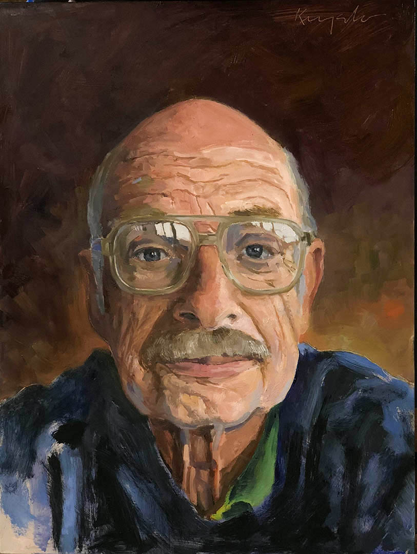
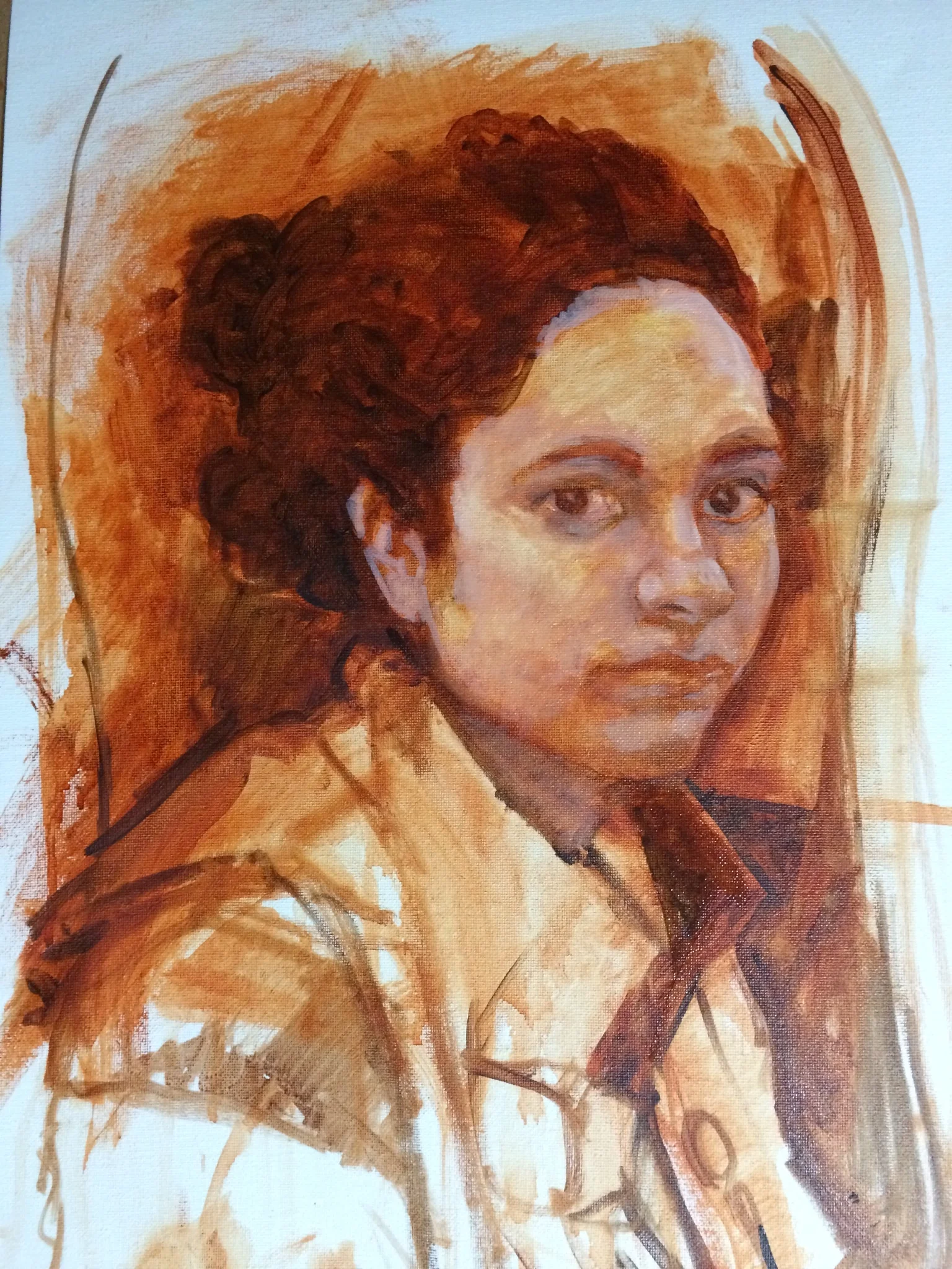
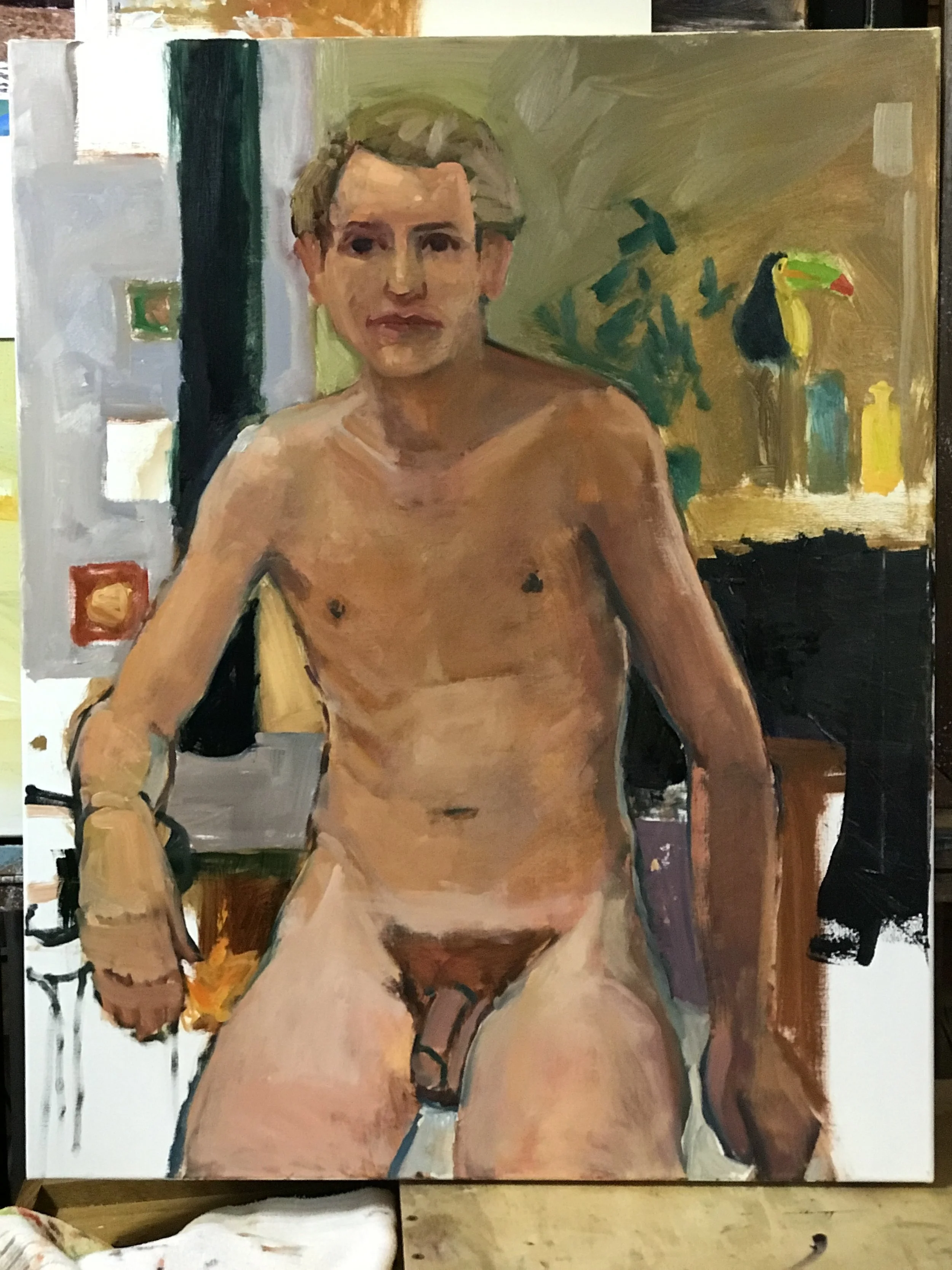
This is my brother-in-law Moose aka Dick. He is the craftiest cribbage player in the known world. It had been a long time since I'd done a portrait so... As mentioned in earlier posts I've been looking for color neutrality in my paints. Achieved. This was painted with Sloan's bicolor and hue mixes almost exclusively. It's not like I wouldn't have gotten here from my modified spectrum palette but this took no time to find color. I even had time to think about painting rather than chasing color. I was so happy with the color that I have started tubing up the mixes with Judith Reeve's help.
I used this to demonstrate the process on my forum. I started this site to help a few friends with their painting. Anyone one can join. I'll be offering a web site link from there that guides the user through making structured color with a spectrum palette. Coming soon.
Have a look here https://jimkingston.discussion.community/post/starting-new-portrait-9627573?&trail=15
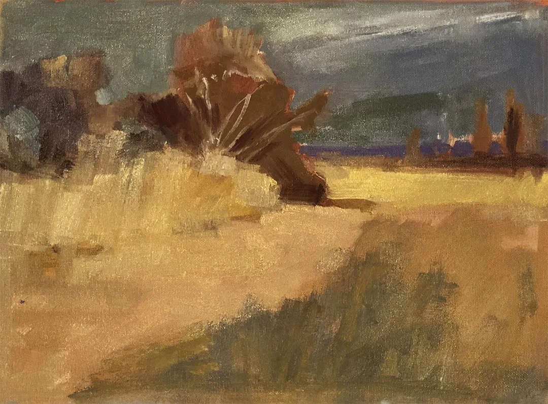
Along the River Road oil on illustration board 15 x 20 2018
This is a painting of a white pine on the river road in Milanville, PA. I have focused on this tree for several years for its unique little setting. It has enough space around it to allow light to get into it. That space has allowed it to spread out and not have to loose it's lower branches. On this cloudless day I notice how beautiful and neutral the scene was. I had to paint it. Had to. It gave me a chance to make a neutral palette from a spectrum palette and paint only with the neutral color.
For several years now Ive been looking for a structured approach to neutral color. Not mixing bubble gum and jellybean colors until I achieve an acceptable 'gray'. But a quick and economical method. The answer was right in from of my face. My life painting friend Judith Reeve had the answer. https://attentiveequations.com
Using H. Denham Ross, Robert Henri and John Sloan as her spirit guides she focuses on the depth and power of the spectrum palette. Sloan created a triangular color grid that, with some pain in understanding, offered me what I was looking for.
Using Sloan's 'color grid' I've begun to build a web based interactive.
The goal. To help artist understand structured spectrum color mixing. By using a visual tool an artist can internalize the process.
Speed and economy.
sample proposed layout for The Power of Sloan's color grid
The Tractor Barn wit o/c 24 x 30
This is our old tractor barn. In it is a tractor and a lot of other stuff. Its old. Made from recycled wood. The beams are just trees.
I photograph this barn all the time and have painted it at least 3 times in the past. There is sits . On a little bump.
This is really a value study using neutralized tints derived from my spectrum palette. The colors are turning out to be very rich and powerful... Stay turned.