On Making Color
This page is dedicated to the observing and mixing oil paint.

12 color spectrum high intensity palette. Mixed from the three primaries
Where to start. My guess would be to understand how this spectrum palette was made. I start with the three primary colors of Red, Yellow and Blue. I then made the Secondary colors by mixing the primaries with one another. Red and Yellow to make Orange. Red and Blue to make Violet or Purple. Blue and Yellow to make Green.
Here we start with the idea of compliments. Red and green are compliments. When we mix compliments we are making to neutralize color. Yellow and Violet are complimentary, Blue and Orange are complimentary. Remember this concept when we are making new neutralized color with compliments.
Now we start making analogous colors or Teriaries. To make Red Orange we mix Red and Orange. We mix Red with VIolet to make Red Violet. Blue and Violet made Blue Violet. Blue and Green make Blue Green. And so on… Green and Yellow make Yellow Green. Yellow and Orange make Yellow Orange. Whew!

Now we have the twelve colors of the Spectrum Palette.
At this point I want to introduce thee concept of (Full Intensity Color SuperScript 7). SemiNeutral Color (Color SuperScript 5) and Hue or Neutral Color (Color SuperScript 3) .
It may be a bit hard to follow so hang on. The idea of using this triangle above comes from John Sloan’s On Drawing and Painting (Dover Books). In it he references the Dudeen Triangle.Another reference for making color is The painters Palette, A Theory of Tone Relations, an Instrument of Expression by Denman Waldo Ross. A couple of old books by old dead guys. But very interesting,
As long as I’m introducing things here about color and value. I like to think of as Color_Value.

Full Intensity color_value chart. I want to emphasis that this is idealized color. Your palette will be different.
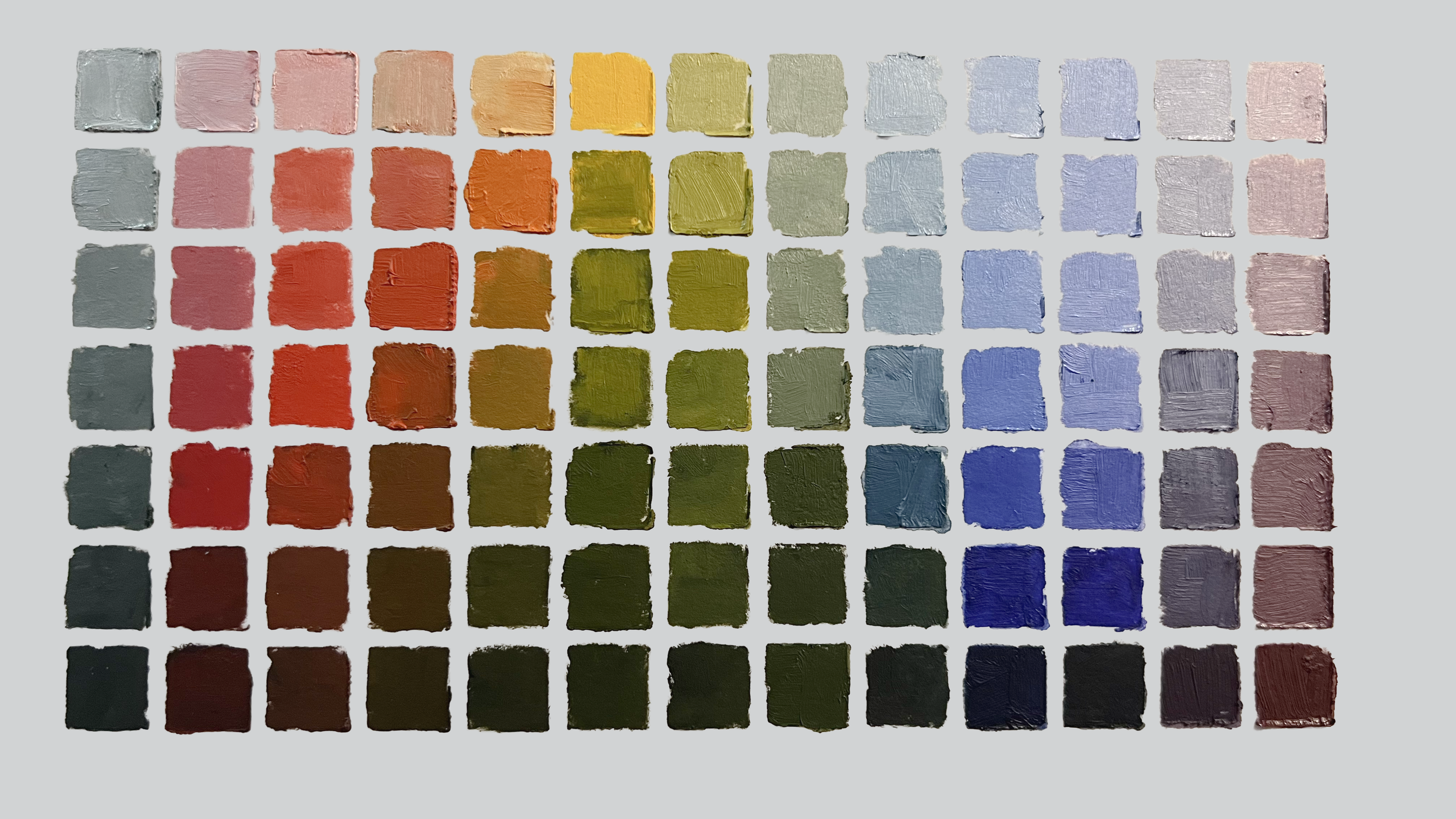
A color_value grid made from my current set of colors. 6/23/25. I use for my everday palette Lukas 1862 professional colors.My secondaries and terries are mixes from the Cad Yellow, Cad Red Deep. My blue is a mix of Cobalt and Ultramarine. This set is a bit dull in the Violets.
This is idealized color made to find a theoretical value curve. My live chart TK does not confirm exactly to this. Notice how there are squares with circles in them. They represent the value of the color out of the tube. The sclerosis on the left is a seven value scale. Black and white are not represented here. Let’s call these squares as numbers 1 to 7 in decending order. The Yellow is of value 1 here.and Violet is 7. All the circles are on a nice sort of sine wave. Surf’s up.
Why is color_value so important. In mixing oil paint we are using the subtractive method of mixing color. Simply put when you mix a color with another the value changes, darkens. If you know your value it will minimize that giant problem If you want a neutralized orange at value 3 you would mix Blue at value 3 with it. Getting a range of neutrals at value 3.

Orange to Blue mix… all the same number 3 value

Left: All 12 Complements blended at value level 3
Right: All 12 Complements blended at full intensity
OKAY but why is this so important to ME?
Having the muscle memory of the fundamentals of making art is our goal. What do I mean by fundamentals?
Basic forms, perspective, value and COLOR. Also understanding the use of our palettes is dependent on understanding the whole palette. Understanding the relationships of value to color, color and value.
I am focusing on color_value. By understanding this we can become more economical painters. It’s quicker and we will use less paint..
A look at so higher quality paint.
Here i’ll be looking at some Old Holland colors. I will build a spectrum triangle from the primaries. Then I’ll find the semi neutral metaphoric primaries by mixing tertiary pairs.
Lets start with some more charts that represent in idealized color how thing mix.
Here we have the structure for mixing metaphoric primaries on the bottom lefr. The result on the right.

Below is the process of mixing the Tertiary Pairs to create the Metaphoric Primaries used to build the Semi Neutral Spectrum.

Now i’ll make these colors using real color with Old Holland paints. The red is Scheveningen Red Light. The Yellow is Scheveningen.Yellow Light.The Blue is Ultramarine Blue.

This is a painting I started a year ago just before our model ran away to Burning Man. I think I use it to explore the new Old Holland colors. I had to make a few corrections to get to this. Now on to painting.
This is Catherine. She posed for our small painting group off and on foe 10 years. We had a show in 2018 at the Delaware Valley Arts Alliance Gallery in 2018 The Model Show, 1 model 2 years 3 Artists. A great success. Then came Covid.


The spectrum palette with semi neutral primaries. Bottom mix mess is flesh tones mixed from semi neutral primaries

After about 40 minutes I have a coat. of paint on the figure. I’m not going to do this up to realism. I’m just hoping for some great color. This image is a bit muted.
Next I’ll do the surroundings.